

Role Researcher | UX/UI Designer
Platform HoloLens Simulation & Mobile Application

Space travel has long intrigued humankind, and to date, outer space trips have been limited to scientific expeditions. However, growing interest from private companies, who are collaborating with government space travel initiatives, means space tourism and interplanetary travel is becoming more of a reality than ever before.
This design brief hence prompts us to imagine the various interactive applications and systems within pre, mid and post-flight situations, which may be integral to the commercial space experience of the future.

To set the scene for the brief, we outlined a fictional context looking 50 years in the future. Mankind has successfully settled and begun building infrastructure on Mars. Space tourism has gained traction and the first space cruise to the Mars settlement, will hold 100 passengers and crew on board.
When prompted with the notion of commercial spaceflight, the first thing our minds turned to was the imminent risk. Emergency situations on Earth can be catastrophic without the correct preventative measures in place, so what more in an unfamiliar and isolated environment?
For consistency across our research, we shared an overarching objective:
To understand how emergency situations occur and can be addressed amid a spaceflight, to inform how we can better prepare and educate crew and passengers for safe and secure space travel.
Within this problem space, our team identified two key stakeholders – passengers and crew members. During an emergency, the behaviours, motivations and frustrations differ for each group, revealing a diverse range of problem areas to explore.
Additionally, emergency responses can be characterised by both pre-flight education and mid-flight communications.

What education and training procedures must crew participate in to prepare for emergency situations?

How are emergency situations internally communicated and addressed between crew members amid space-flight travel?

How knowledgeable are passengers of potential emergencies? How do emergency briefings and procedures affect perceptions of readiness in light of emergency situations?

How are alarms, alerts, and other communication methods used to disseminate critical safety information to occupants during emergency situations?

What education and training procedures must crew participate in to prepare for emergency situations?

How are emergency situations internally communicated and addressed between crew members amid space-flight travel?

How knowledgeable are passengers of procedures? How do briefings affect perceptions of readiness in light of emergencies?

How are alarms, and other communication methods used to disseminate critical safety information to occupants during emergency situations?
Hover for research questions.Unlike any present day design problem, this brief called for the prediction of potential needs in a speculative world, existing far in the future. The bulk of our research centred around existing contexts similar to that of space travel, including everything from campuses to air travel, and mission-based spaceflight.
To kick off, we conducted some background research of existing documentation and precedents. These studies were supplemented with a competitors analysis of existing solutions, and an online ethnography, where we harvested user content surrounding emergency experiences. The findings helped build foundational awareness and expectations for the problem space.
To supplement these background studies, we also conducted remote, semi-structured interviews with relevant participants.
Four individuals were considered to be crew members, who have participated in emergency response training and hold responsibility over their respective occupants if an emergency were to occur.
Four individuals were interviewed as 'ordinary' occupants who have experienced true emergencies or drills in various contexts, typically within a public space.
We tailored interview questions for each group of participants, and probed further when interesting points were raised.
Flooded with qualitative responses, we adopted a bottom up approach in our affinity diagramming, allowing themes to emerge from key quotes.
Having explored four distinct facets of the problem space, we came out of this phase with a vast number of insights about the context, and potential users. The following highlight some key issues.

Training and education methods that do not reflect realistic situations are poor means of teaching. Training methods are often generalised, and may not be relevant to one's role and responsibilities.
You do not really know how to react in emergencies until they happen...because confidence comes with experience.

One-way communication methods with poor feedback limits effective team responses under pressure.
Its hard to effectively communicate with others without two-way...the devices we use are restricting.

Occupants often fail to take emergency procedures seriously, and briefings that are repetitive in nature are not necessarily the most effective in getting the message home.
Watching the safety demo is like watching a boring TV commercial that you've seen hundreds of times.

Experiencing alarms frequently, especially drills, creates a culture of alarm fatigue and habitual ignorance to communications.
I feel like when I hear lots of alarms, I assume that they are all just practice runs.
Inversely, hearing or seeing emergency alarms often induces panic instead of a trained response.
I think I would panic hearing an emergency alarm because I won't know what to do.
We felt that all the insights we had extracted were valuable, and worth addressing, so we began by ideating concepts for all four of the problem areas. These began as quick one-line ideas, which we then elaborated through sketches.
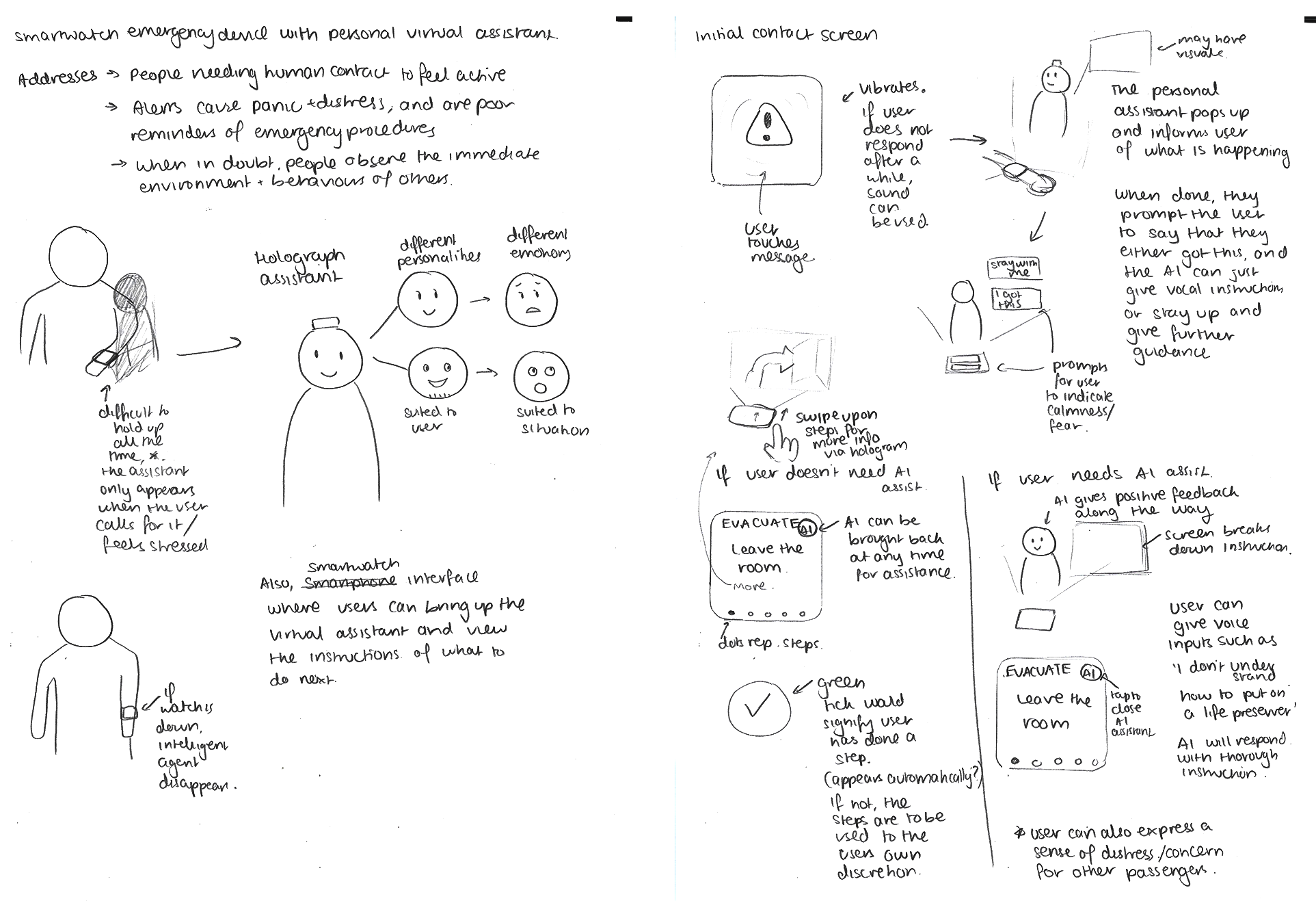
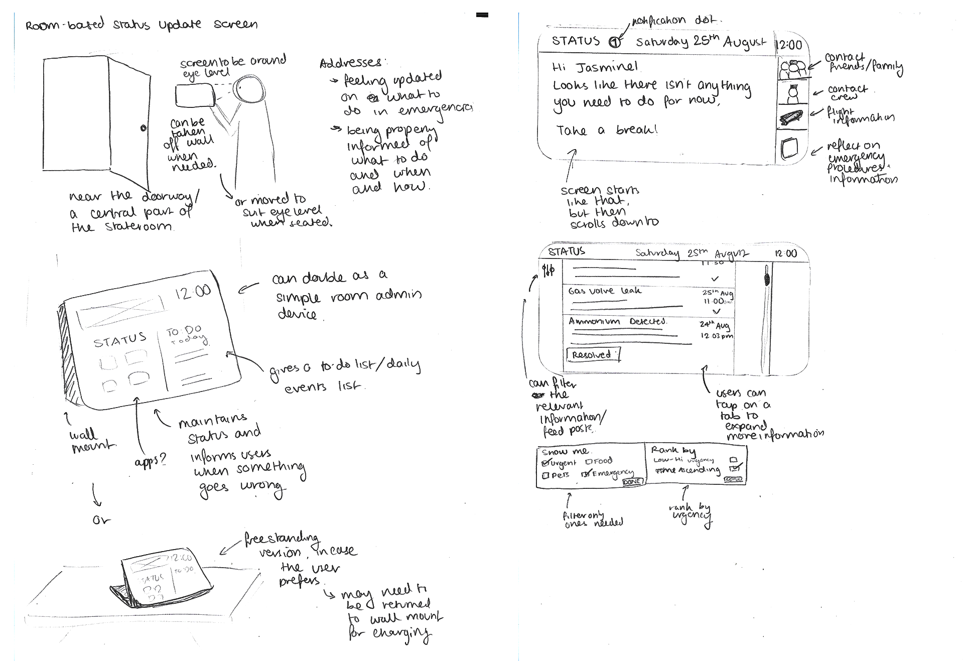
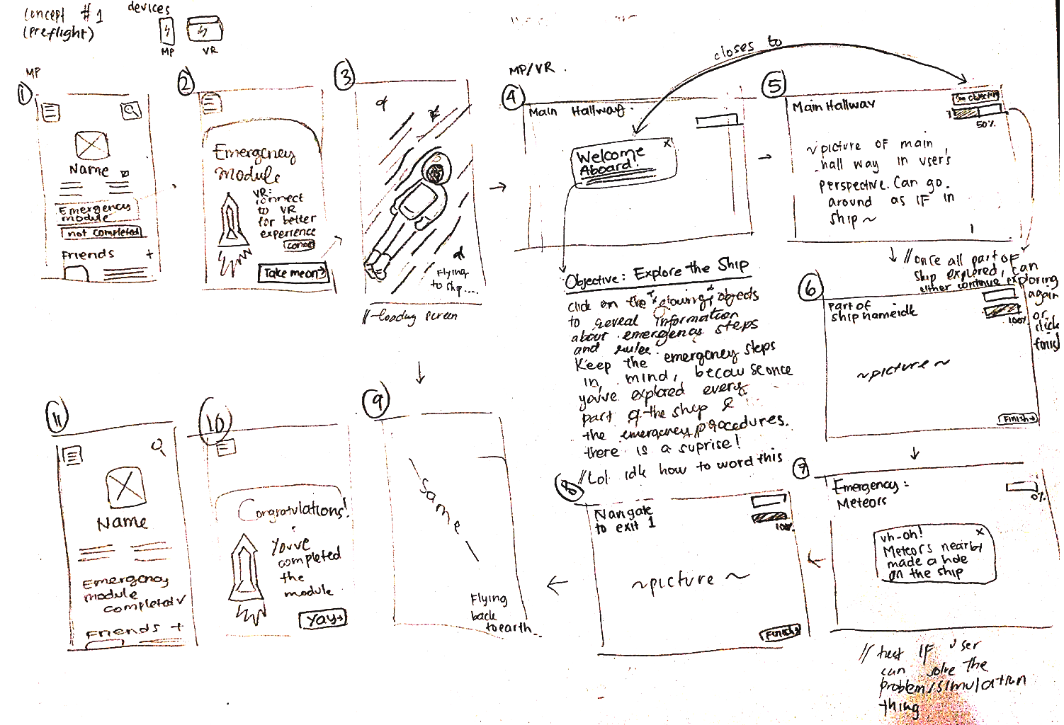
To supplement our decision making, we compared solutions within the specific problem area which they address, compiling scores in a Pugh Matrix.

We decided on solutions that not only satisfied the criteria, but could add value for our users, which led to us pursuing a total of four concepts – the most relevant one for each problem space.
With these concepts ready to go, we discussed ideas as we worked, visually telling through further annotated sketches. We used these sketches as artefacts in our first round of evaluations, asking potential users for their opinions regarding the concepts. This session allowed us to get on the same wavelength as our users and understand their initial perceptions.
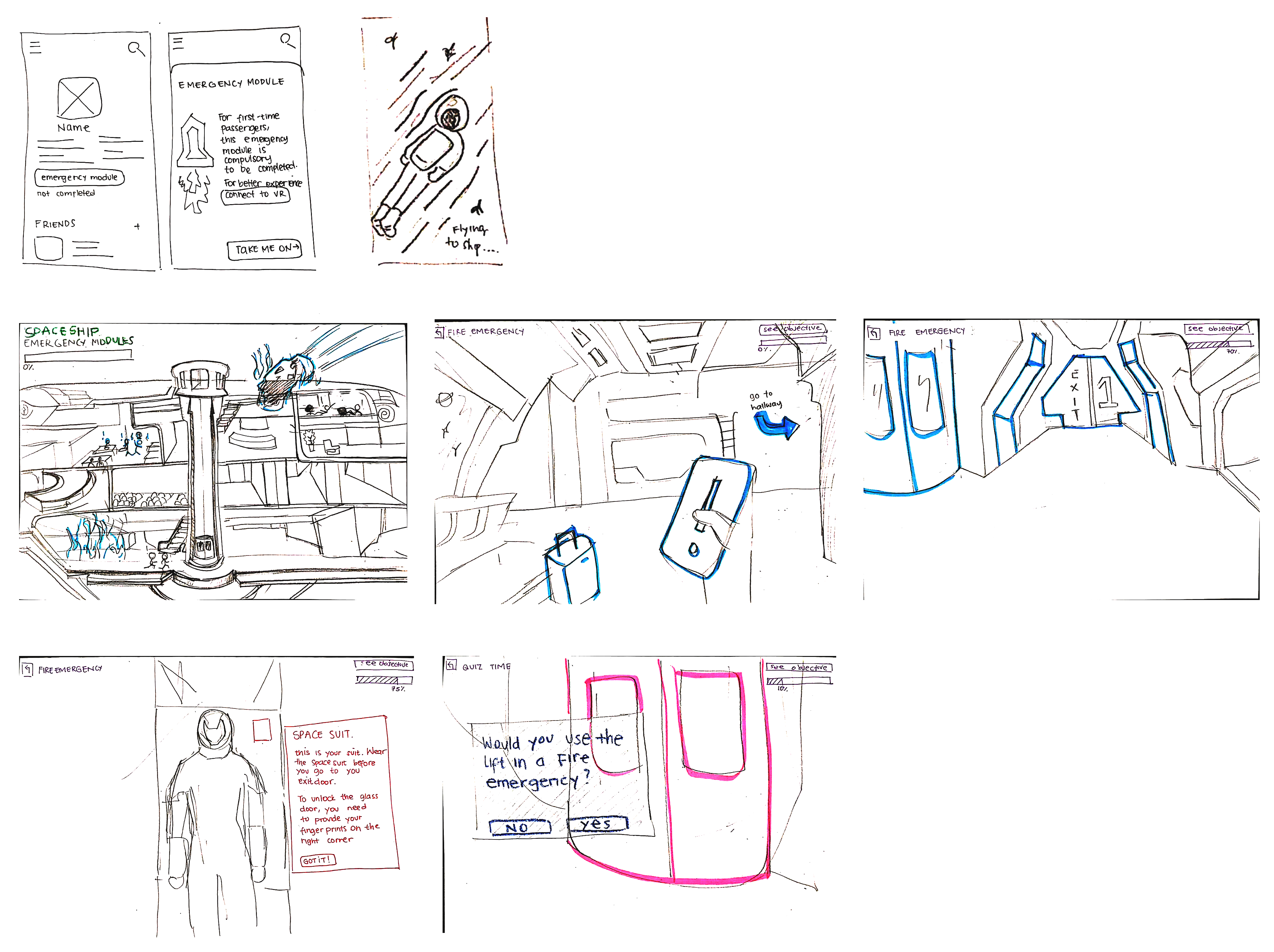
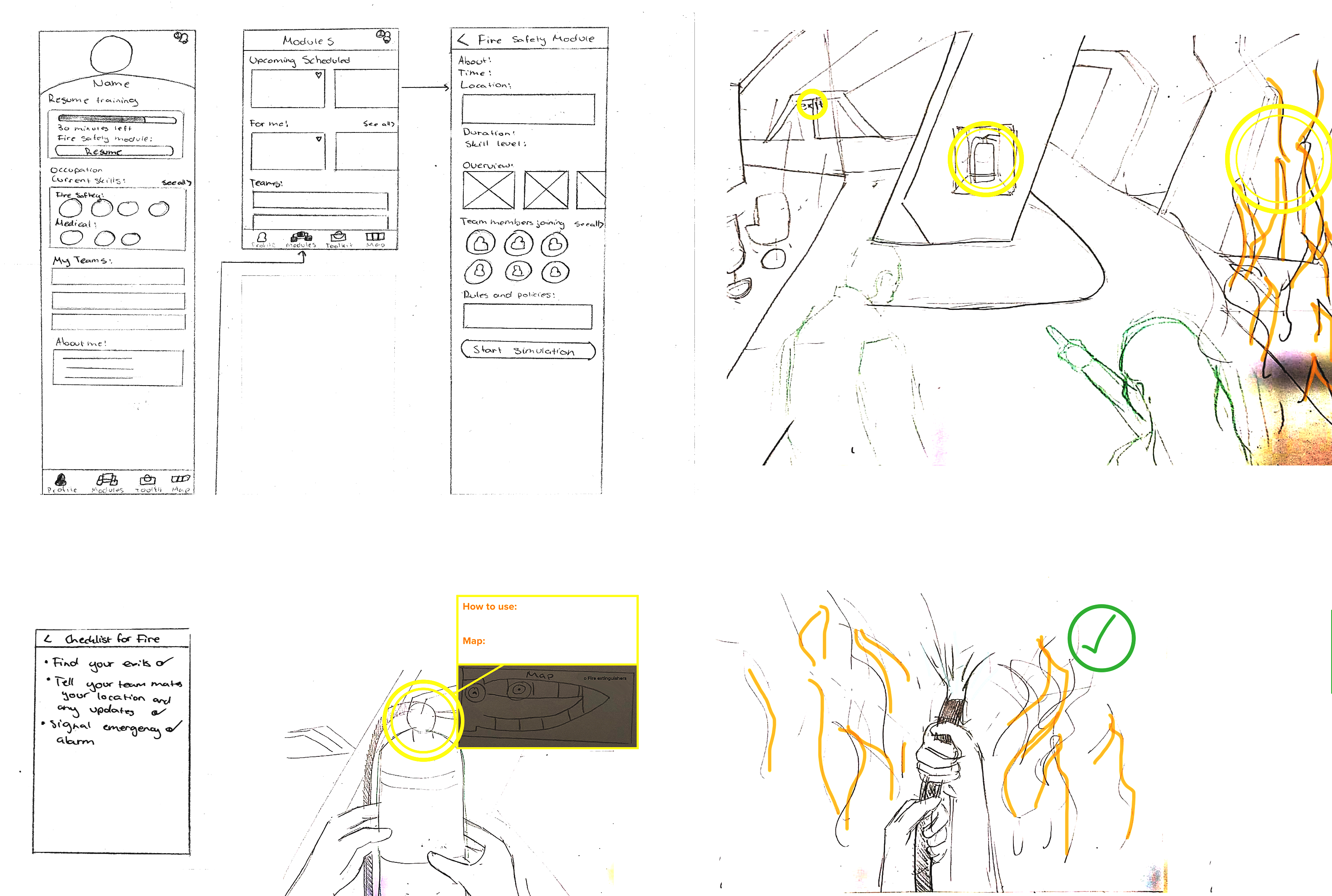
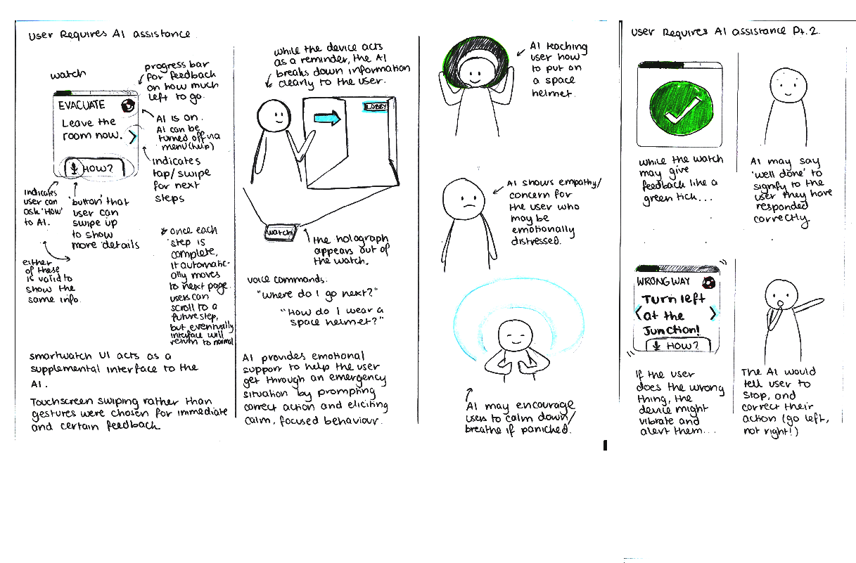
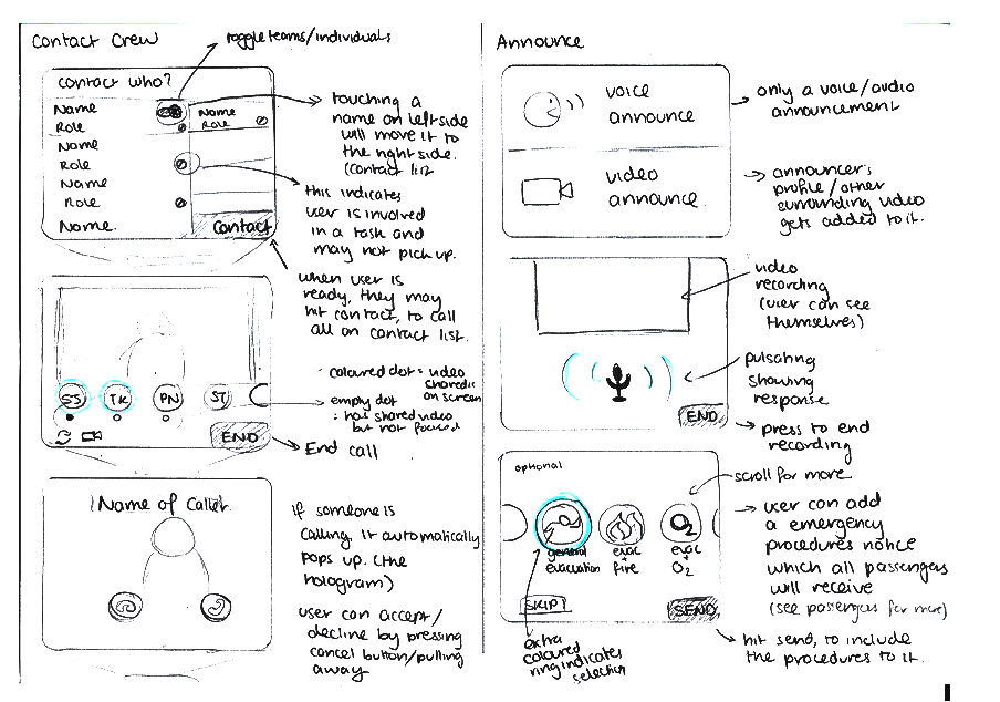
Some key issues with our designs that had emerged during user evaluations were underlying problems that we had overlooked, such as that holding one's arm up to use a smartwatch as a communication device would be tiring and cause discomfort. Early testing with users was highly beneficial for pointing out blindspots before we pursued a design.
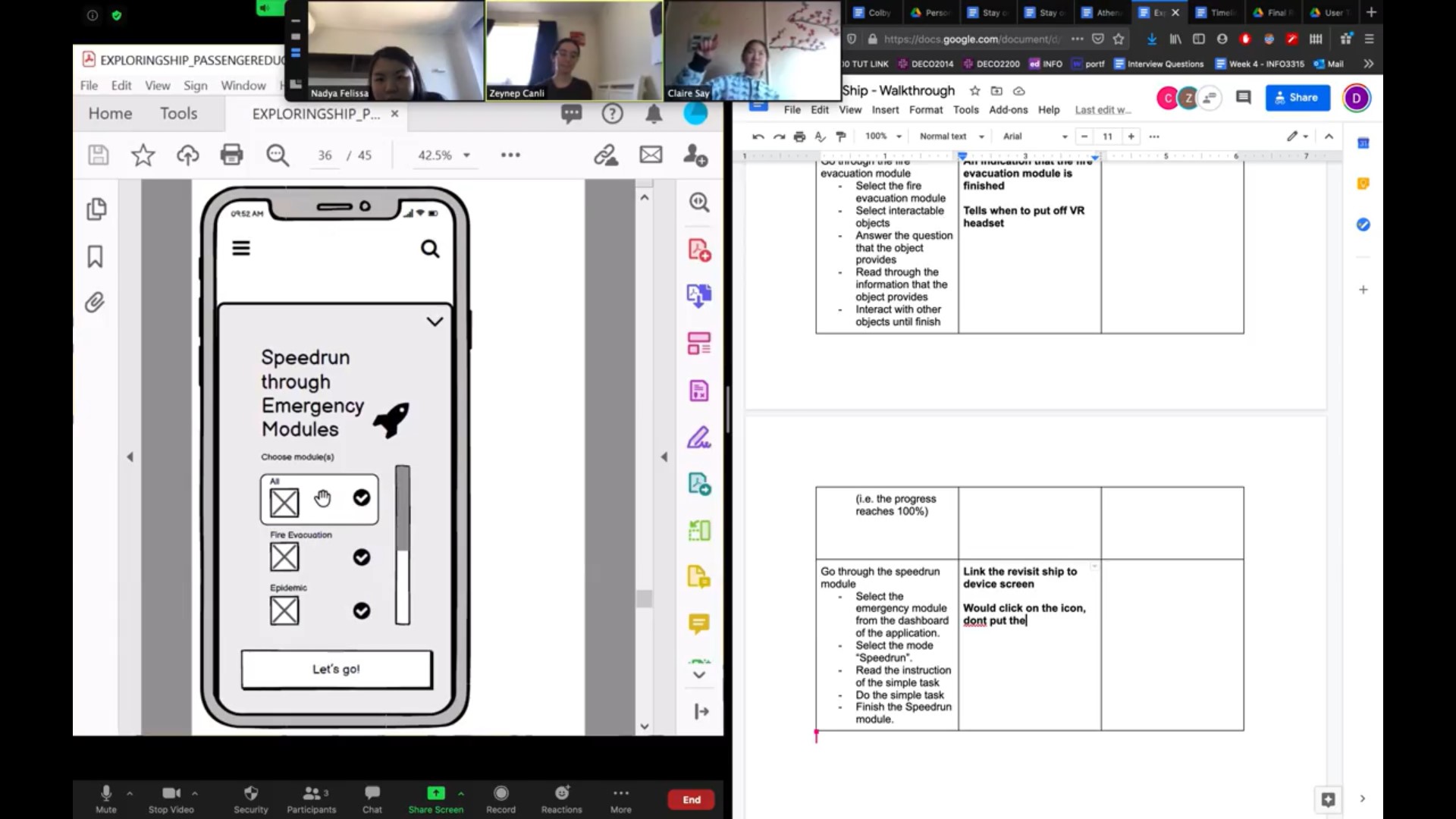
Based on this feedback from potential users, we were able to address any issues raised, before creating lo-fi Balsamiq wireframes for a minimum viable experience.
Stay on Trek is a HoloLens emergency training simulation supplemented with a mobile application for additional mid-emergency support.
The Athena intelligent agent for smart glasses is designed to support efficient emergency communication amongst crew through voice interactions and simple visual feedback.
Exploring Ship is a VR-based decision-inspired-outcome experience to educate passengers of correct emergency procedures through realistic scenarios.
Colby is a holographic intelligent agent installed on a smartwatch device. Colby acts as a guide for alerting passengers and communicating emergency procedures.
To evaluate the usability of these concepts, we conducted one round of usability testing with five potential users. For each concept, we outlined a set of tasks, which participants would perform as they interacted with the low-fidelity prototype. We requested that they think aloud while performing tasks, so we could understand their thought process.
All our concepts were flawed, and this round of evaluations inspired a number of structural improvements. We ended the low-fidelity iterations with journey maps to summarise the proposed concepts.


Despite all four design solutions being viable and worth pursuing, turning them all into high-fidelity designs would be a time and resource intensive move. Making justified design decisions early is a vital step towards achieving a tangible solution. For this very reason, our team opted to conduct persona-based walkthroughs and a heuristics evaluation to objectively decide which idea to continue with.
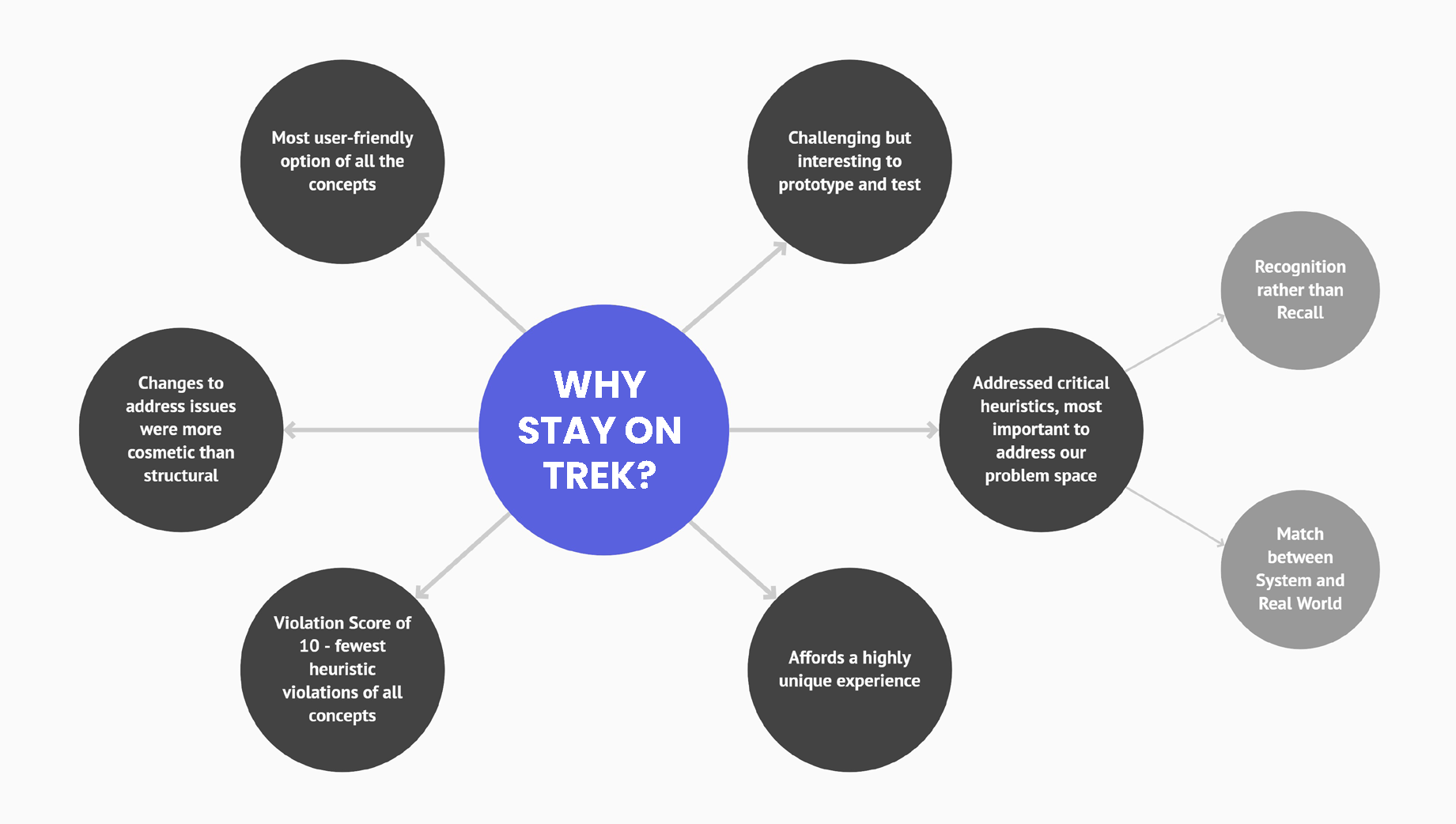
Based on evaluation outcomes, we came to the decision to pursue Stay on Trek as our final concept, turning the wireframes into high-fidelity prototypes in Figma for the mobile application, and Unity for the HoloLens simulation.
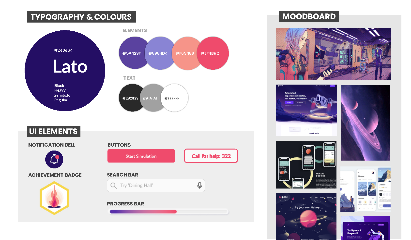
For consistency across the entire application and HoloLens experience, we developed a style guide, inspired by the unusual vibes of outer-space, to bring a practical design vision to life.
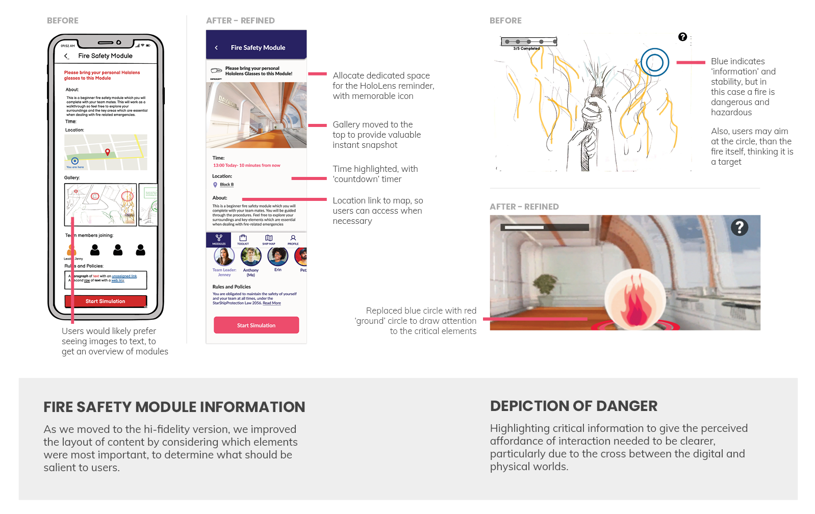
We put this first high-fidelity prototype through a round of heuristic evaluations prior to a final round of usability testing, to iron out unforeseen problems with the interface.
Without a proper HoloLens headset, or equipment like a fire extinguisher, we did our best to simulate the experience with a Wizard of Oz inspired setup. With a limited interactive Unity prototype, we could 'fake' gesture-based interactions to make the experience as believable as possible.
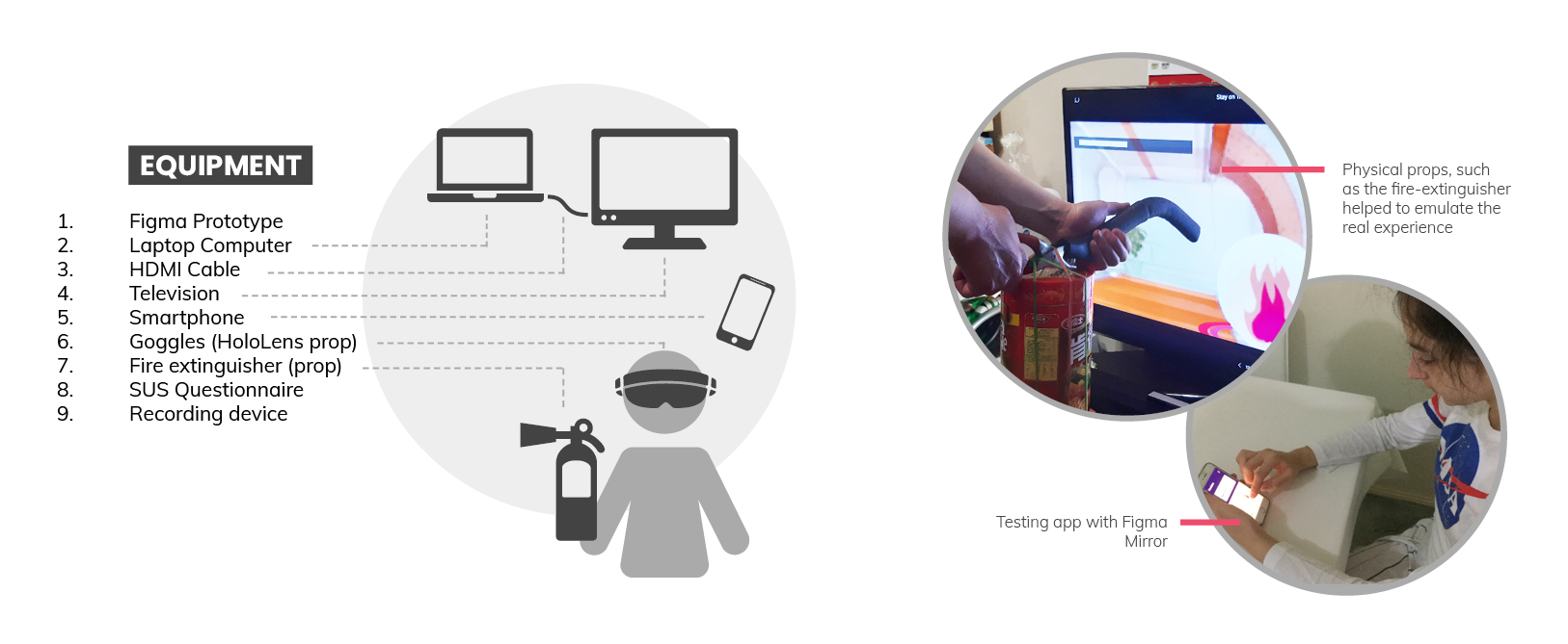
The outcome of the final user-testing session gave us further insights from which we iterated upon our interface designs and interactions, one more time.
Stay on Trek is a crew training and resource solution for commercial spaceflight situations. Its main function supports HoloLens simulation modules that crew members must complete, either pre-flight, or as a refresher midflight. Thus, through immersive training experiences (HoloLens) and supplementary repositories of emergency procedures (Mobile App),
Stay on Trek aims to elicit an effective and efficient crew response during emergency situations amid a commercial spaceflight.
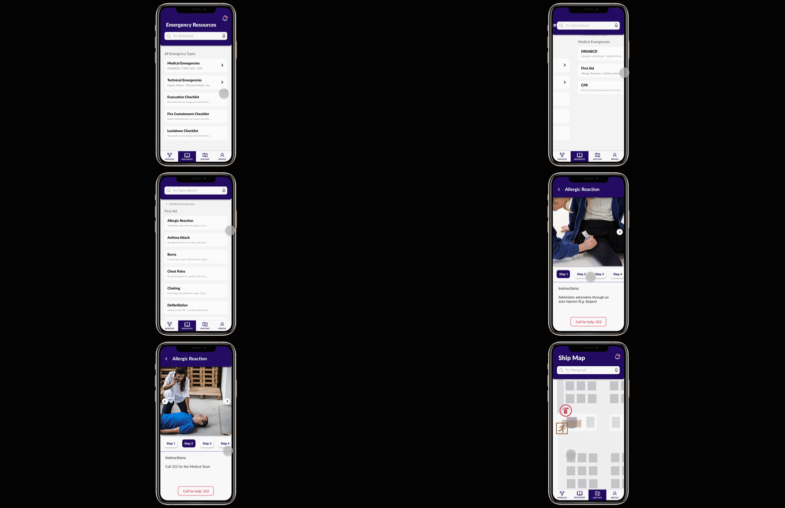

Engaging muscle memory helps to instil intuitive responses in preparation of real crisis situations

This helps make team and individual learning organised, informed and engaging

These resources may help quell panic when making mistakes or forgetting correct response procedures in the moment
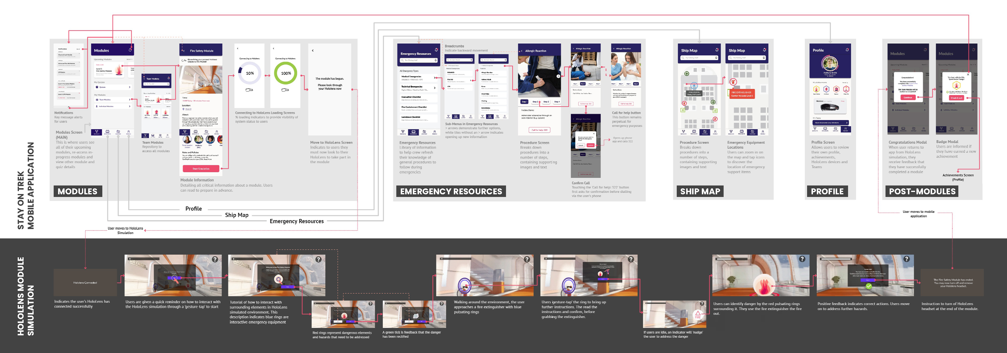
The following is a video walkthrough and screen flow for the entire interactive experience (app & HoloLens).
This project appeared insurmountable at the very beginning, and in the time period given to complete each step, it seemed as though it would be impossible to achieve a phenomenal outcome. However, this project taught me the importance of breaking big goals into little steps, setting milestones for each team member to meet a deadline in time. The end result that we finished with blew our own expectations out of the water.