
Role UX/UI Designer | Front End Developer
Platform Responsive Web

The brief asked us to produce a digital experience that enables medical students to independently learn about heart pathologies in small children. The interaction would be used alongside 3D printed heart models to facilitate guided case explorations, with the intent of keeping students engaged in learning about such anomalies.
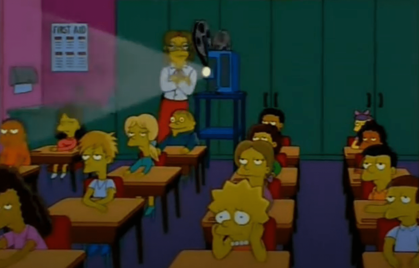
Learning about the use context, we found that medical students in this class would watch a decades old video which demonstrates how to identify defects in infant hearts. Students then passed around waxed cadaveric hearts and were encouraged to explore the specimens by poking them with a pipe cleaner.
Facilitators found that students felt the lessons were quite tedious. With a lack of guidance they were confused and often lost interest in the area of Paediatric Cardiology.
Looking into this existing classroom experience helped us identify the main pain points to address:

Scarce supply of waxed cadaveric hearts, were also deteriorating with age. Rural students did not have access to these resources at all.

Outdated material made the lesson seem tedious, while students had limited time with paediatric cardiologists to ask questions and solidify their understanding.

A hands-on approach with the heart models was valuable, but unguided exploration made the experience confusing and ineffective.
As we sought to understand existing 3D anatomy software for education, we realised the models were complex, layered and often generative. The standard to which Primal Pictures and BioDigital present the models and the features they included seemed to be useful for specialist medical students.
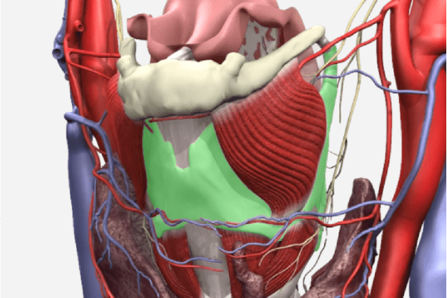
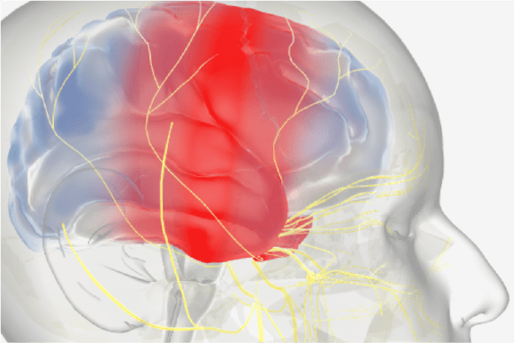
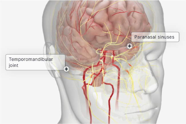
We realised that not all of the above features would be helpful in the context we were designing and developing for – an introductory subject that did not require in-depth specialty knowledge of heart anatomy.
However, we learnt much about the conventions of 3D medical education, such as labelling and visual style, which later informed the layout and progression of our work.
Our method of ideation was centred around brainstorming the various kinds of features we could implement to enhance the experience of the module, as well as how to place them on the appropriate screens optimally to avoid detracting from the main case content. As we were informed that four different cases needed to be completed within a 30-minute block, the efficiency and fluidity of the user experience became even more crucial factors in its design.
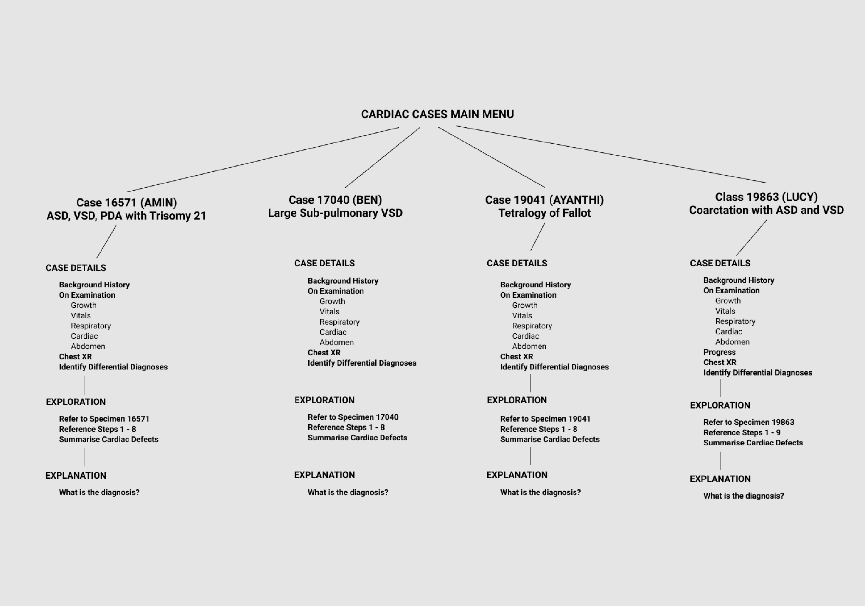
Structurally, the lesson plans were straightforward and needed to be delivered as organised by the education team at the Children’s Hospital. I constructed initial drafts of the user-flow to plan out the progression of case information, especially how variations could be scaled up across each case. I also began to consider features of the UI that were appropriate in each frame.
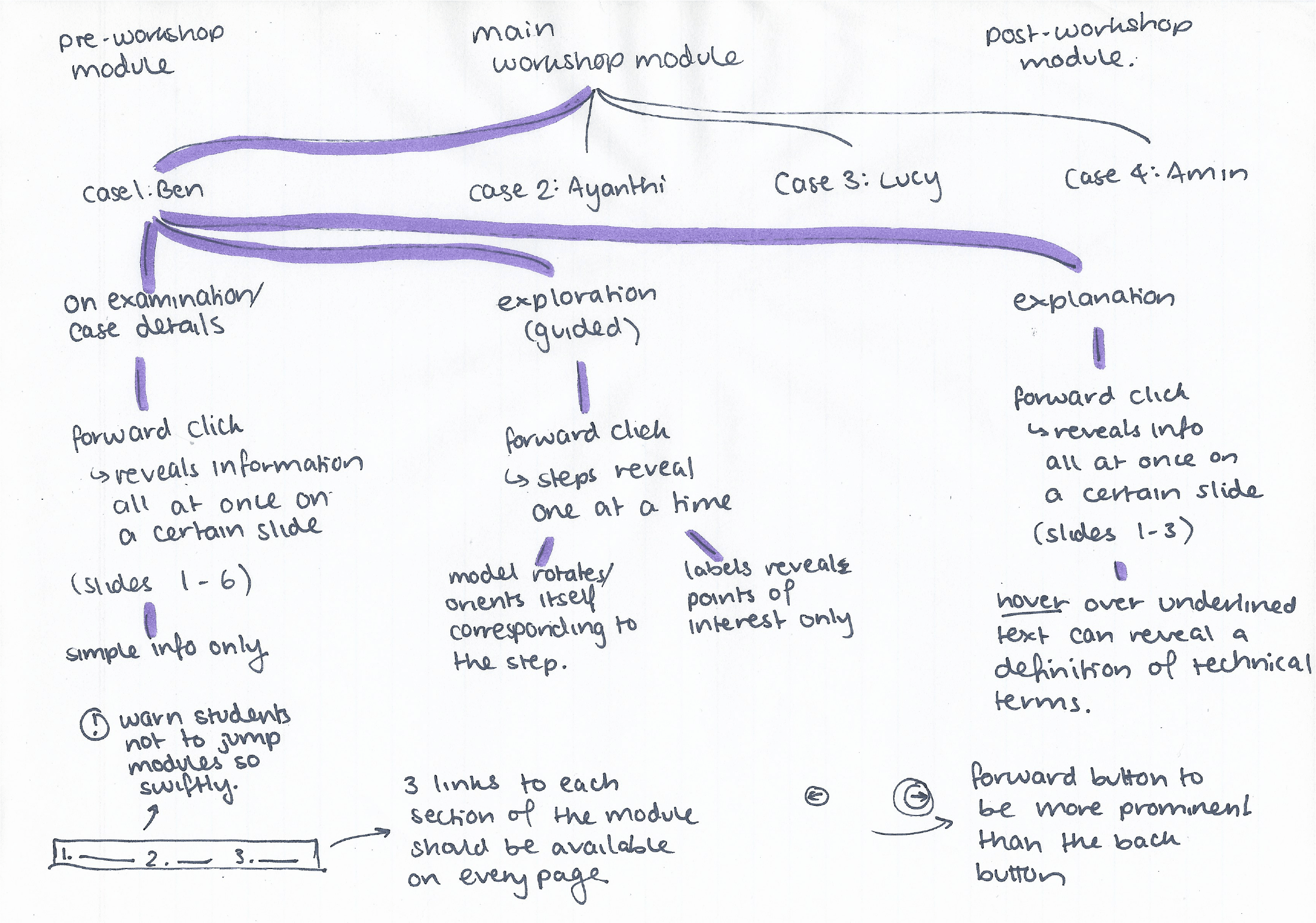
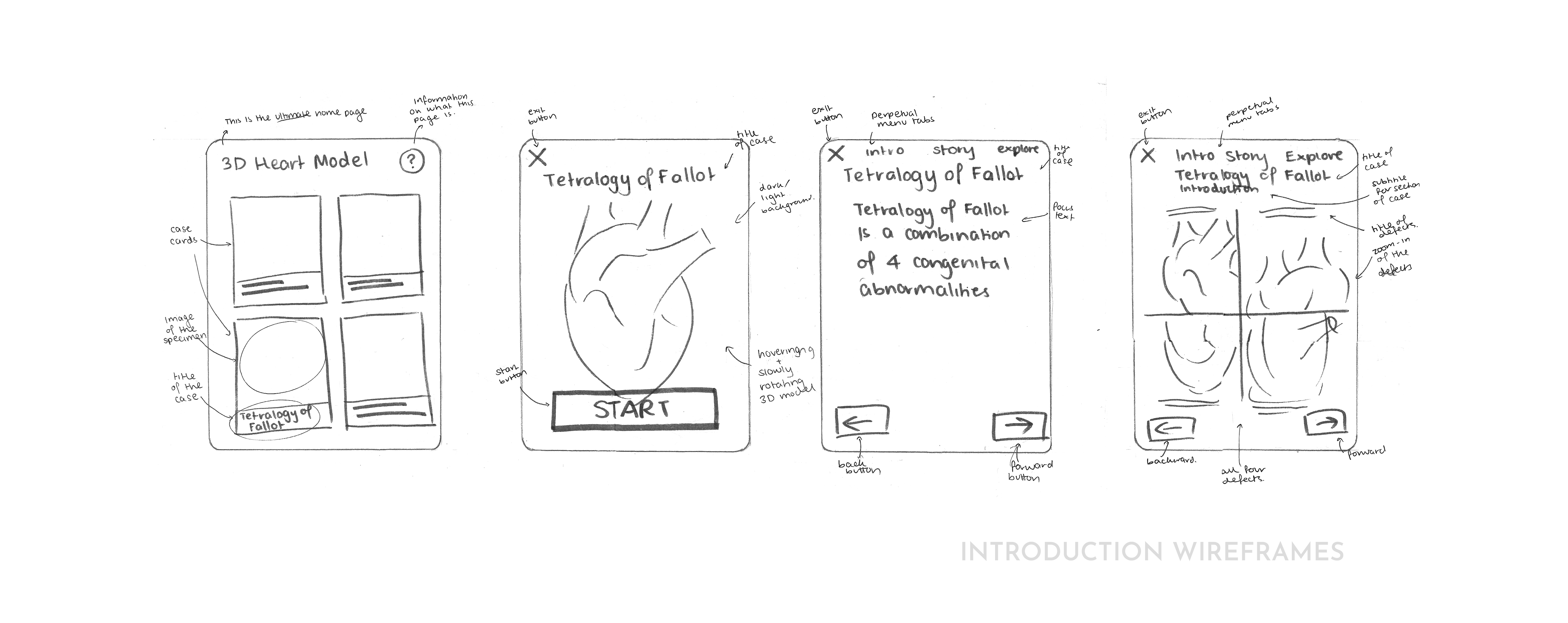
I then turned these paths into wireframes to display the important elements on each screen. This step was iterative, with basic interface versions sketched on paper then constantly refined as the wireframes were brought into the digital space with Figma. We each brought our versions of wireframes together and selected frames that we thought delivered the content best for its context of use.
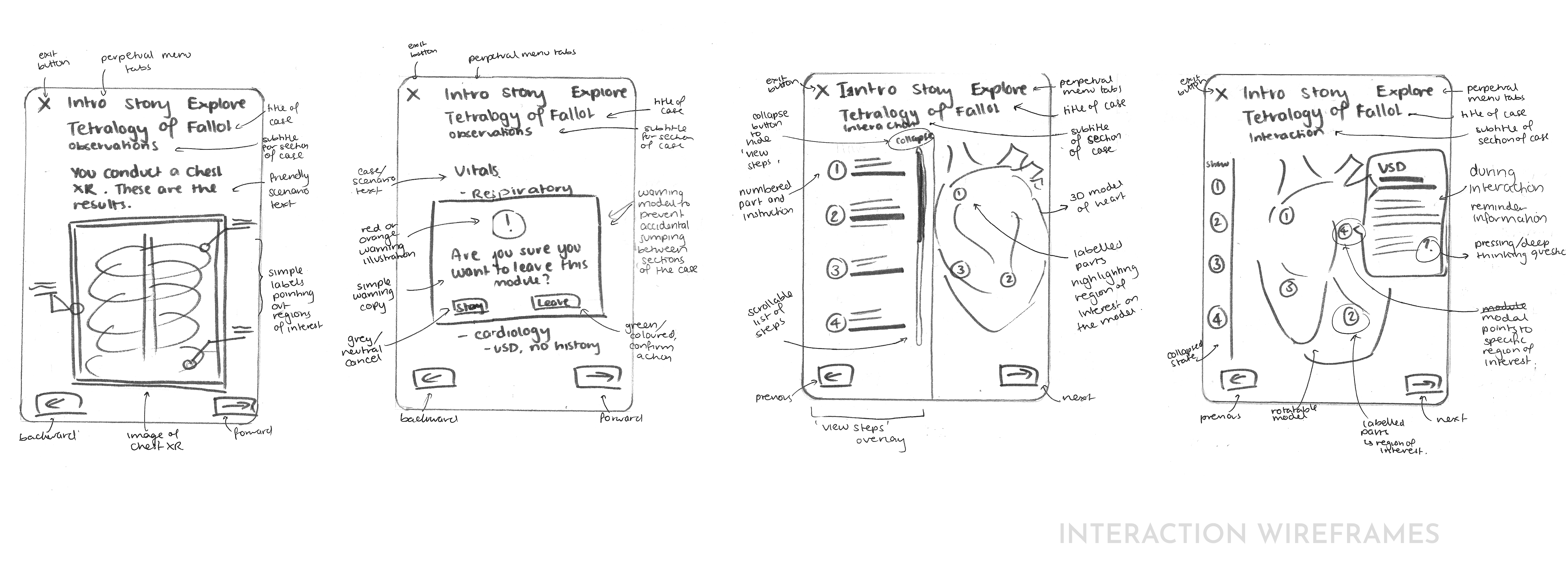
At the same time, we were stitching the wireframes together to form wireflows, visualising the proposed user movement throughout.
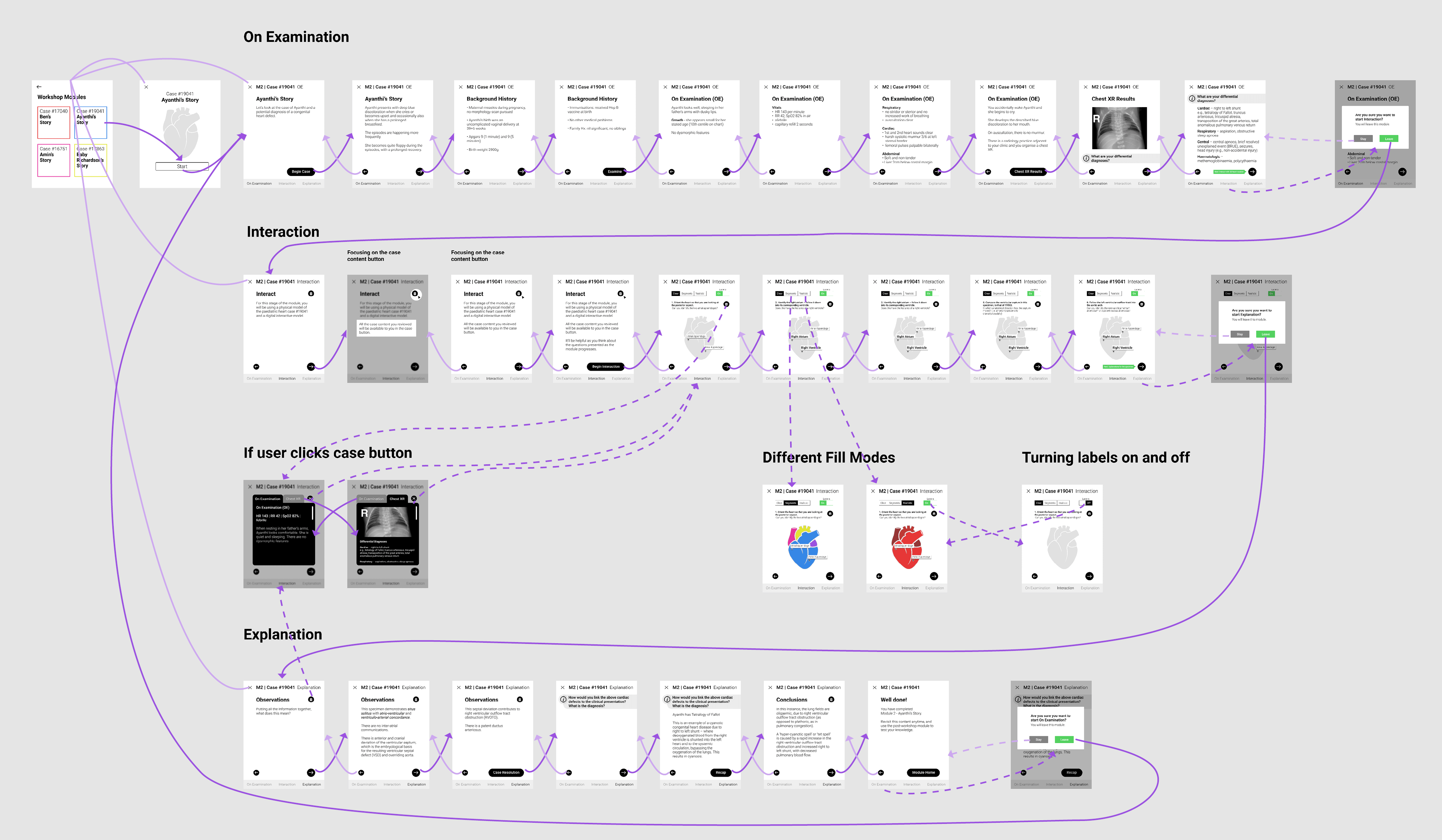
Up until this point, we were told that students would be accessing the module through iPad only. However, we decided it be best that we implement responsive design, so the module is accessible from desktop to mobile. Hence, the style and layout were further iterated upon at this step, as well as during development.
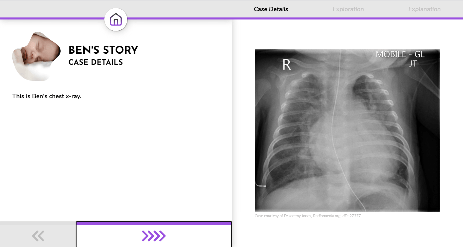
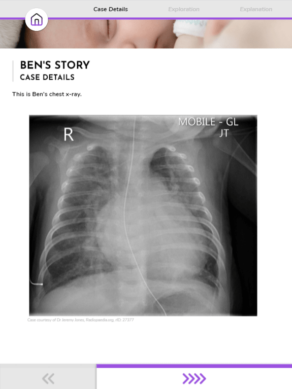
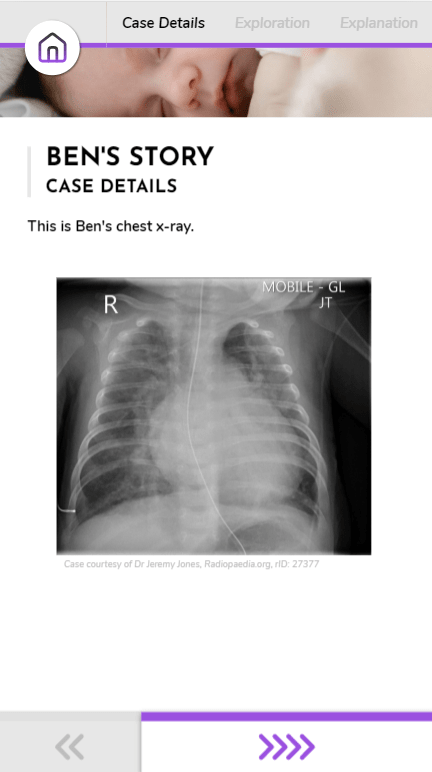
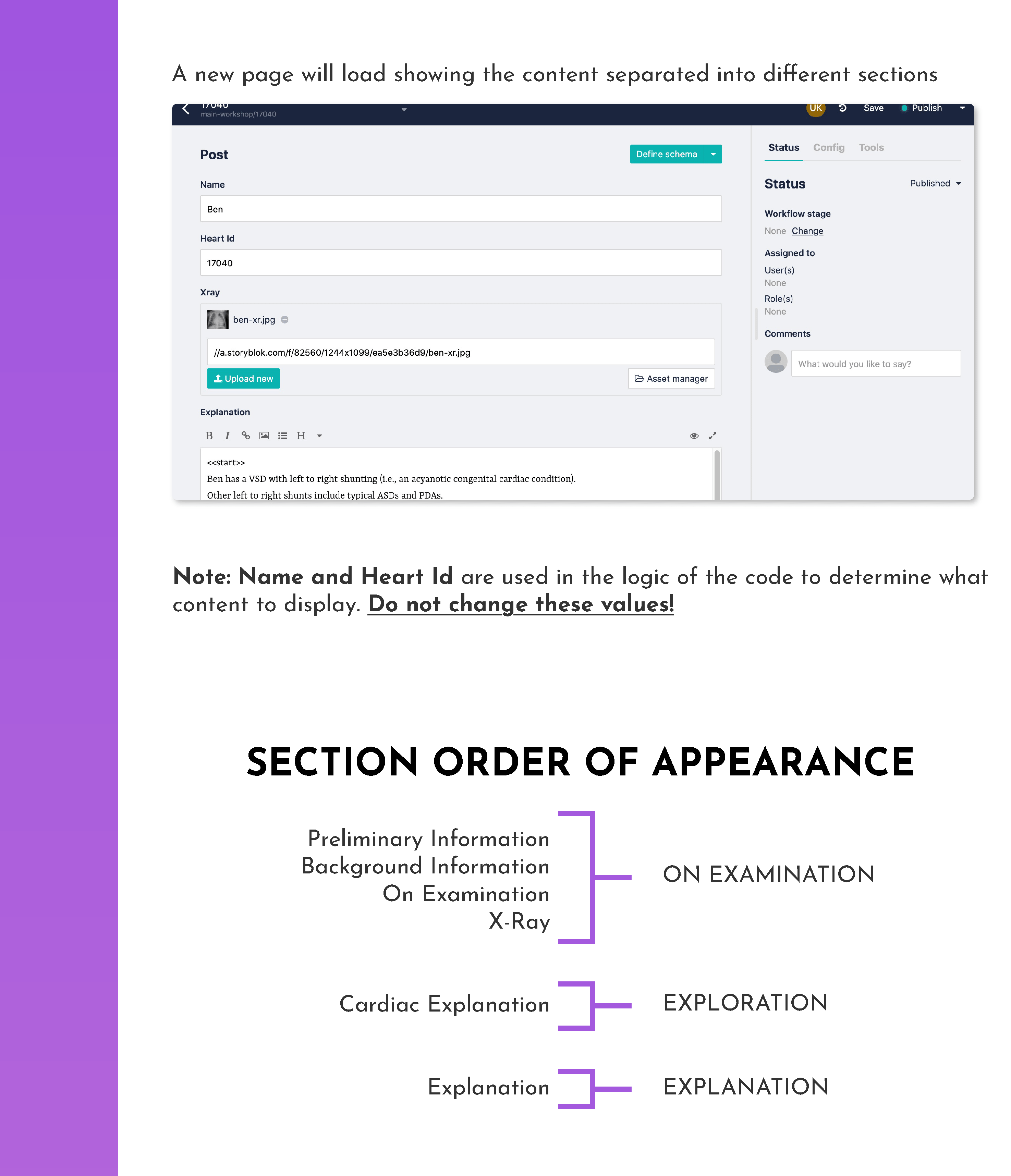
Meanwhile, I began to code basic click-throughs using development technologies HTML, CSS and JS. The click-throughs I developed utilized JavaScript functionality to ensure the structure remained reusable and dynamic, as content would later be made editable in a CMS for those delivering the content. Implementing this element was key in ensuring we addressed concerns surrounding scalability.
My colleague Andrew set up a server using Node.js to run the application locally, as well as the CMS through Storyblok.
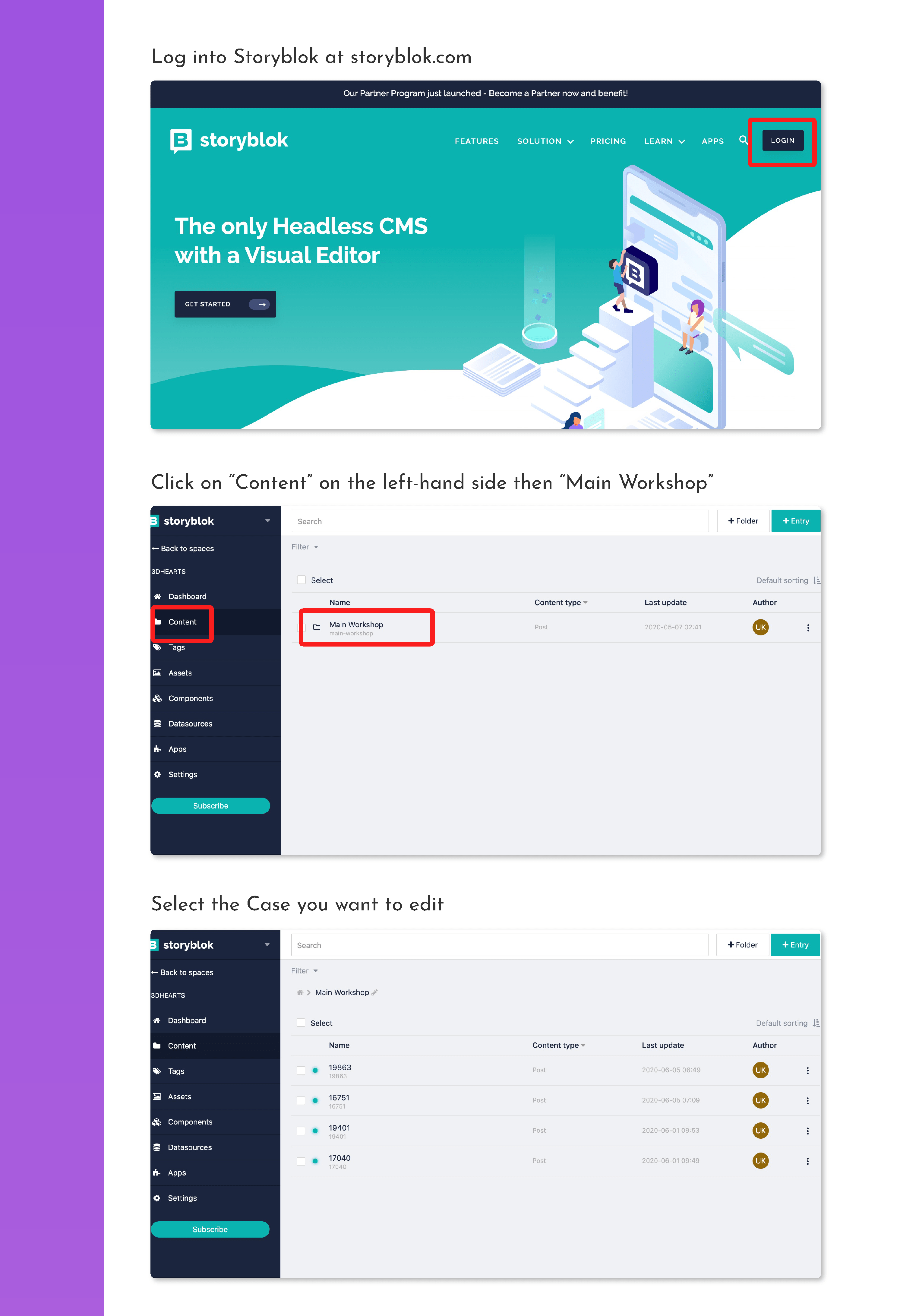
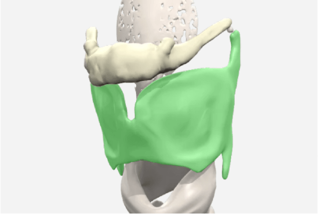
Andrew and I also learnt elements of the three.js library, which would allow the digital heart models to be placed in our web application for interaction. Our initial investigations of existing three.js projects led to us adding features such as a model splice function with dat.gui controls and orbit controls for panning and zooming, giving students the freedom to explore the defective heart anatomy.
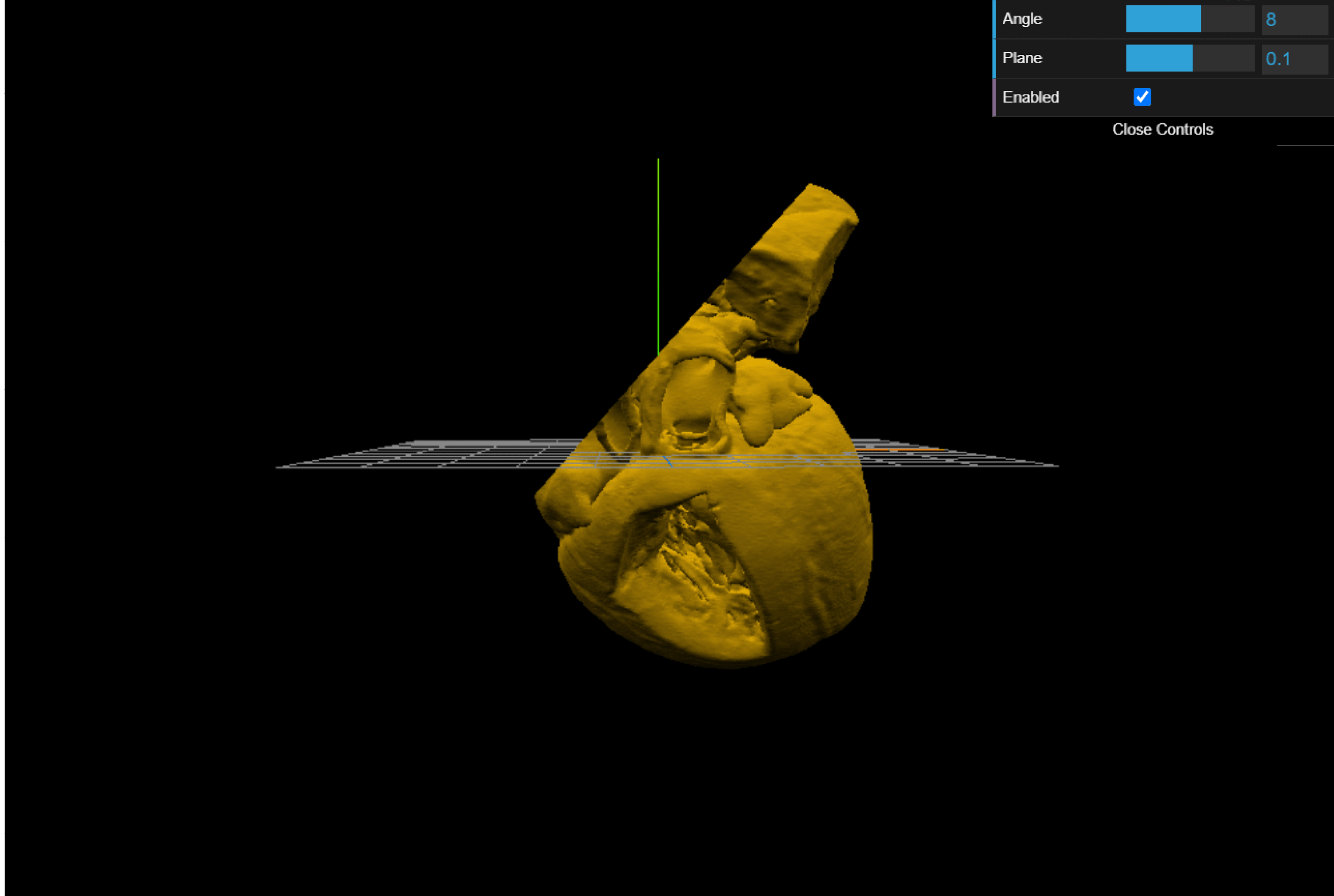
After taking a functional, low-fidelity prototype to the education team with some of these proposed features, we realised many were not actually helpful in the context we were designing for. Features we initially valued, such as splicing functions as seen above, were removed.
Overall, the final interaction comprises of four cases with three sections in each – case details, exploration, and explanation. 'Case Details' and 'Explanation' sections are simple click-throughs, where students read and progress through information at their own pace.
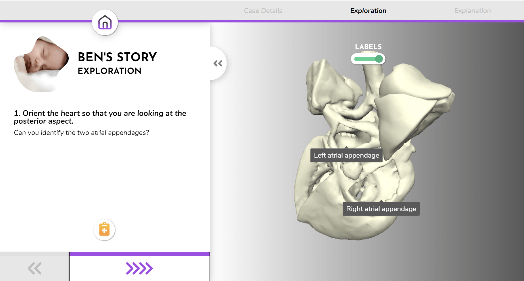
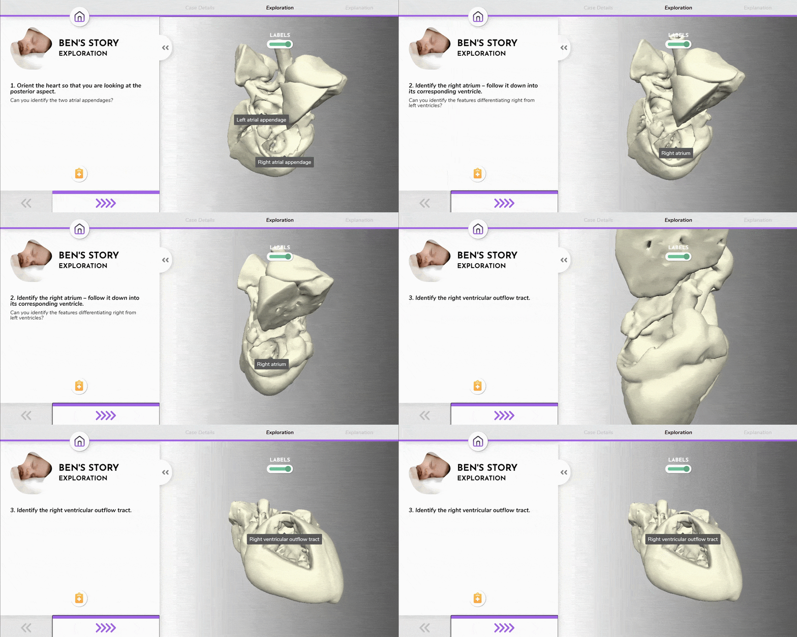
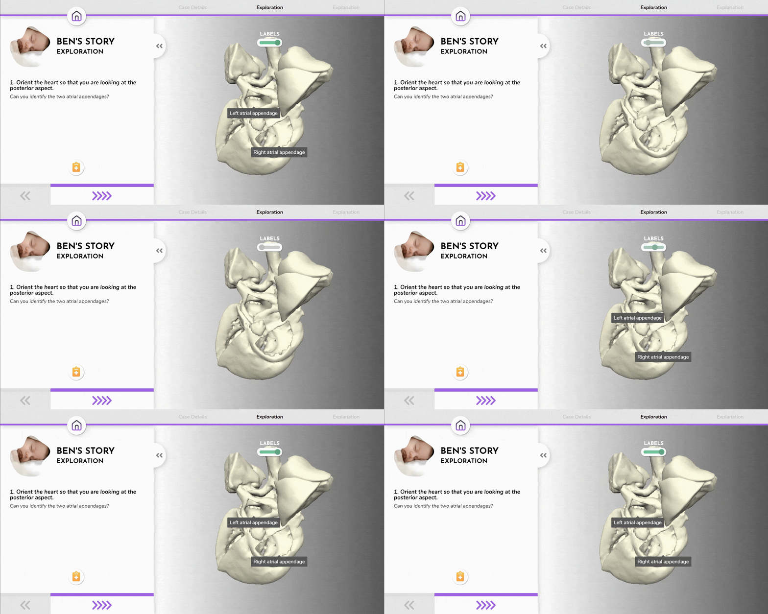
The main 'Exploration' section is where students can progress through instructive steps with an automatically orienting digital heart model to use as a point of reference while exploring the 3D printed model in their hands.
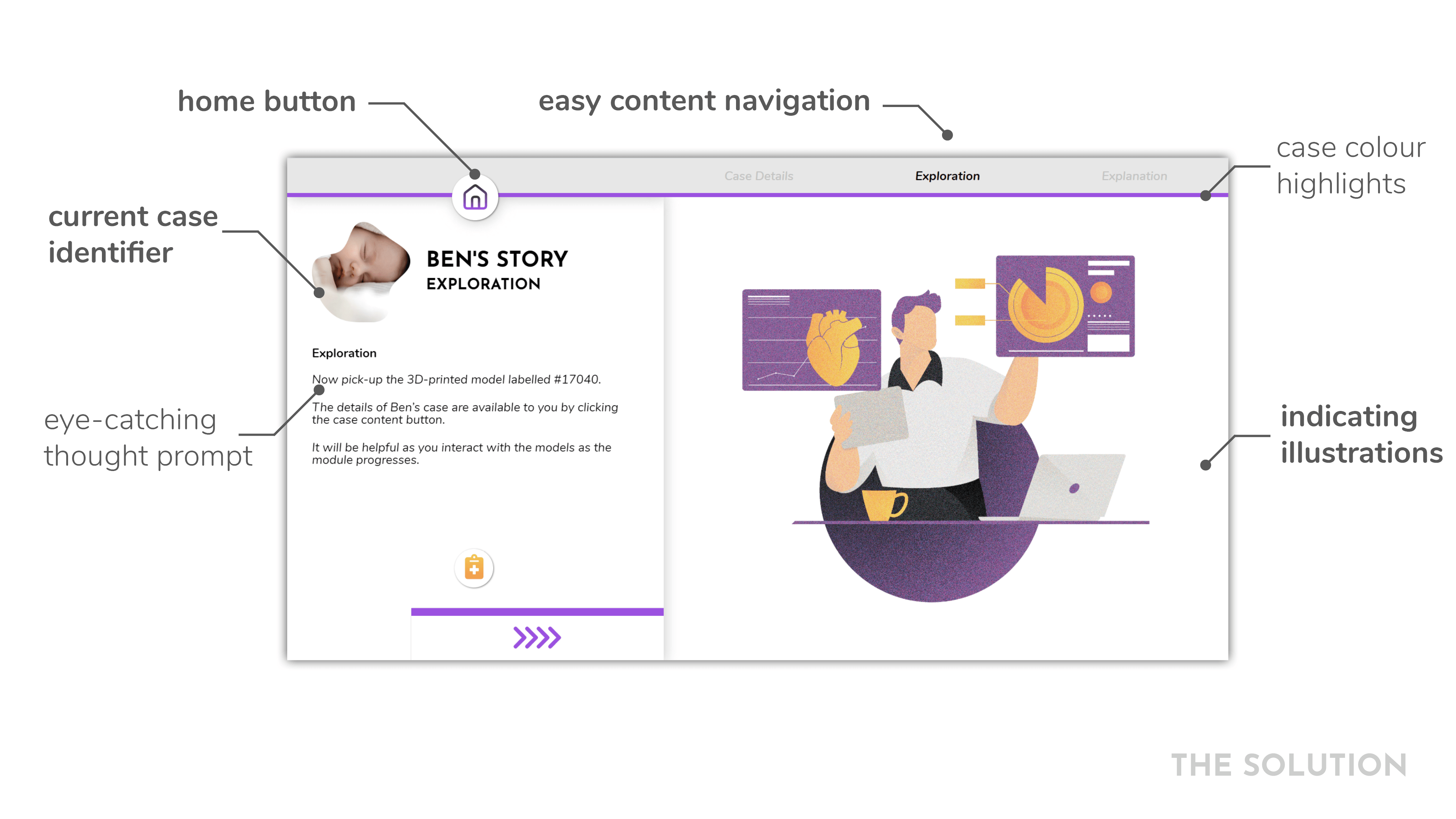
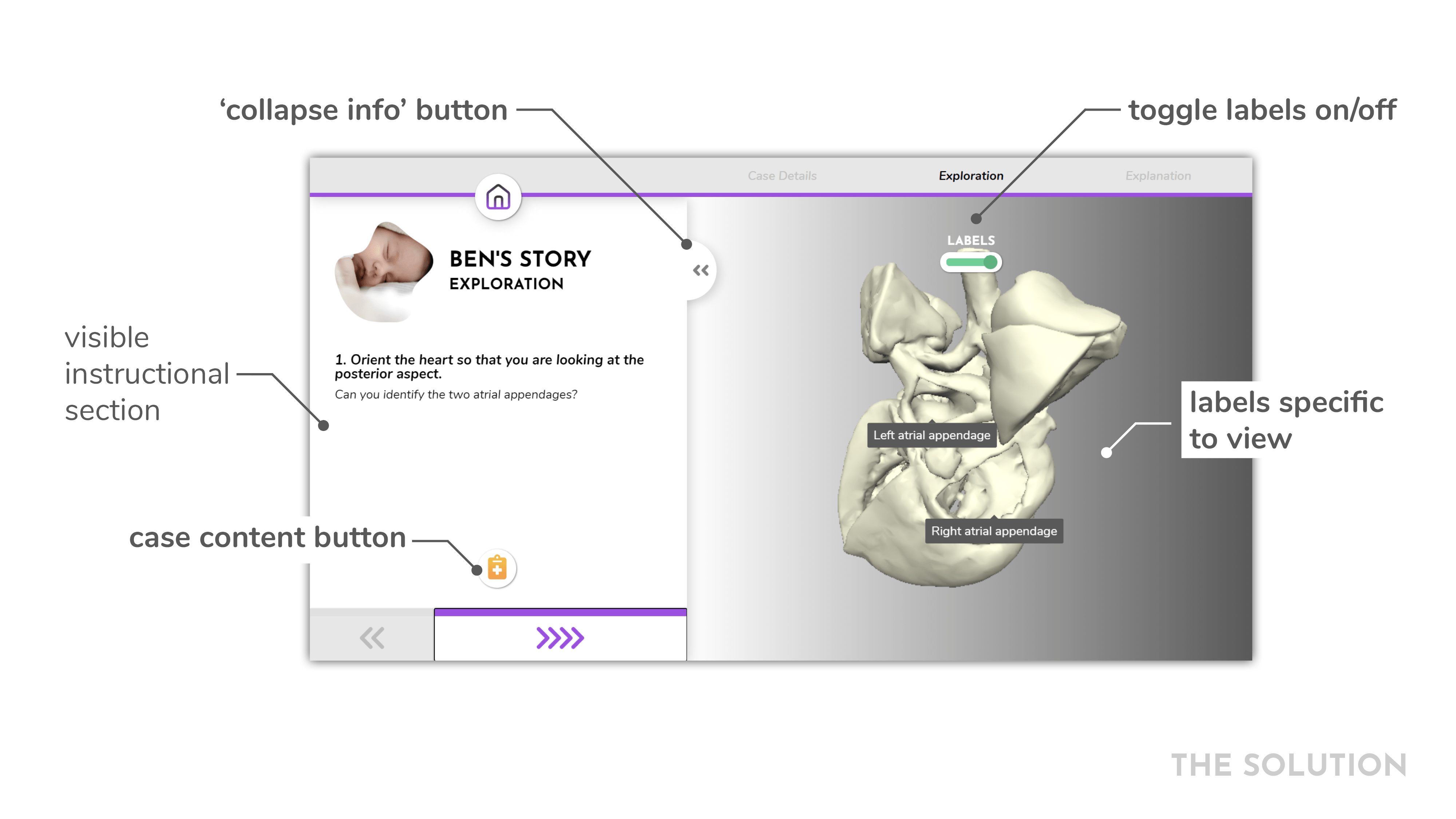

Our module adds structure for logical progression throughout the module, taking away the sense of uncertainty for students.

While the module is optimised to work alongside an exploration of the physical model, it also works autonomously so students can revisit the module independently.

Designed with a responsive structure and careful consideration of the most important features for the medical learning context.
We designed the digital model to orient to the correct viewpoint with only relevant labels visible, so students can focus on the important details.
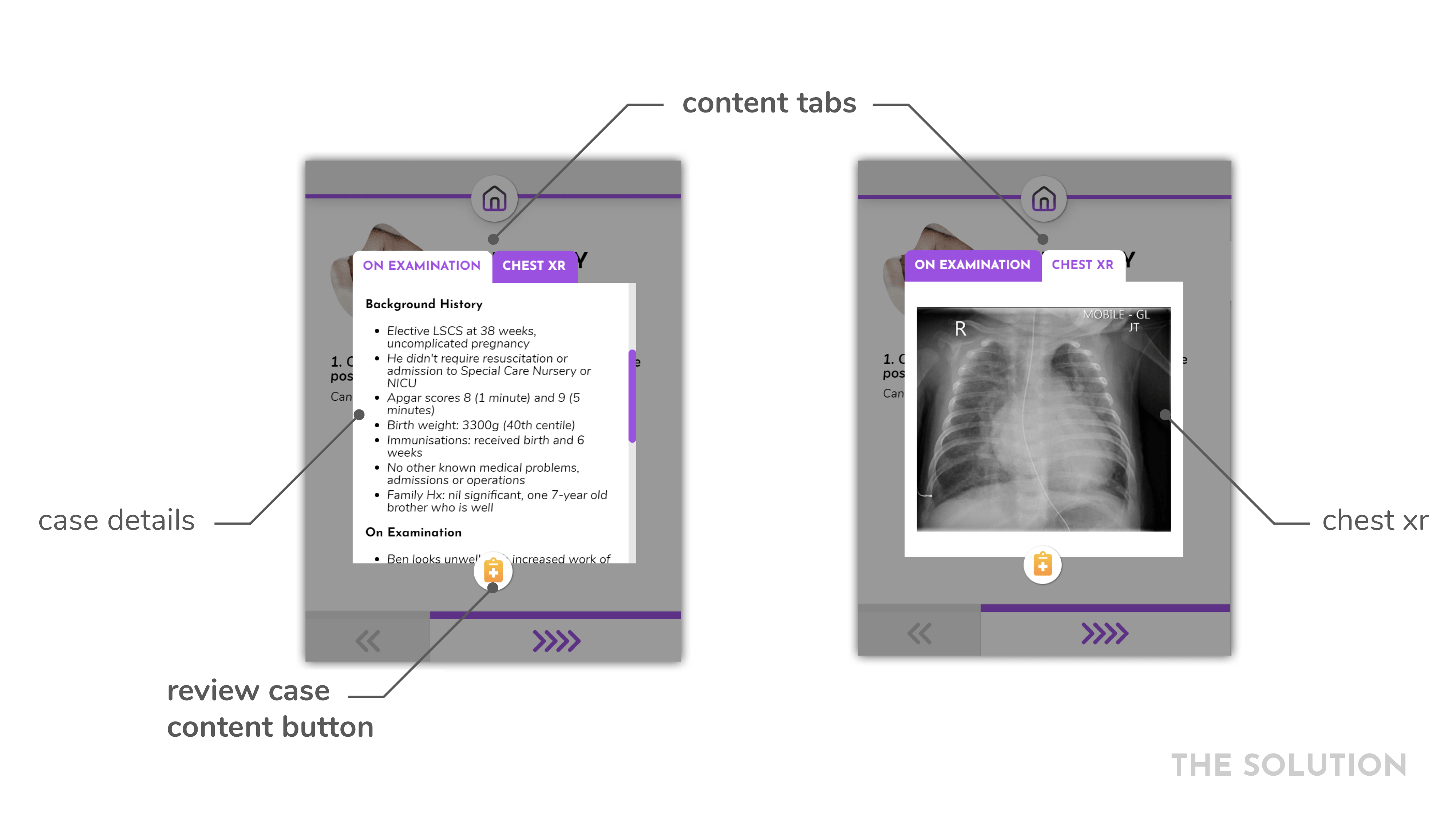
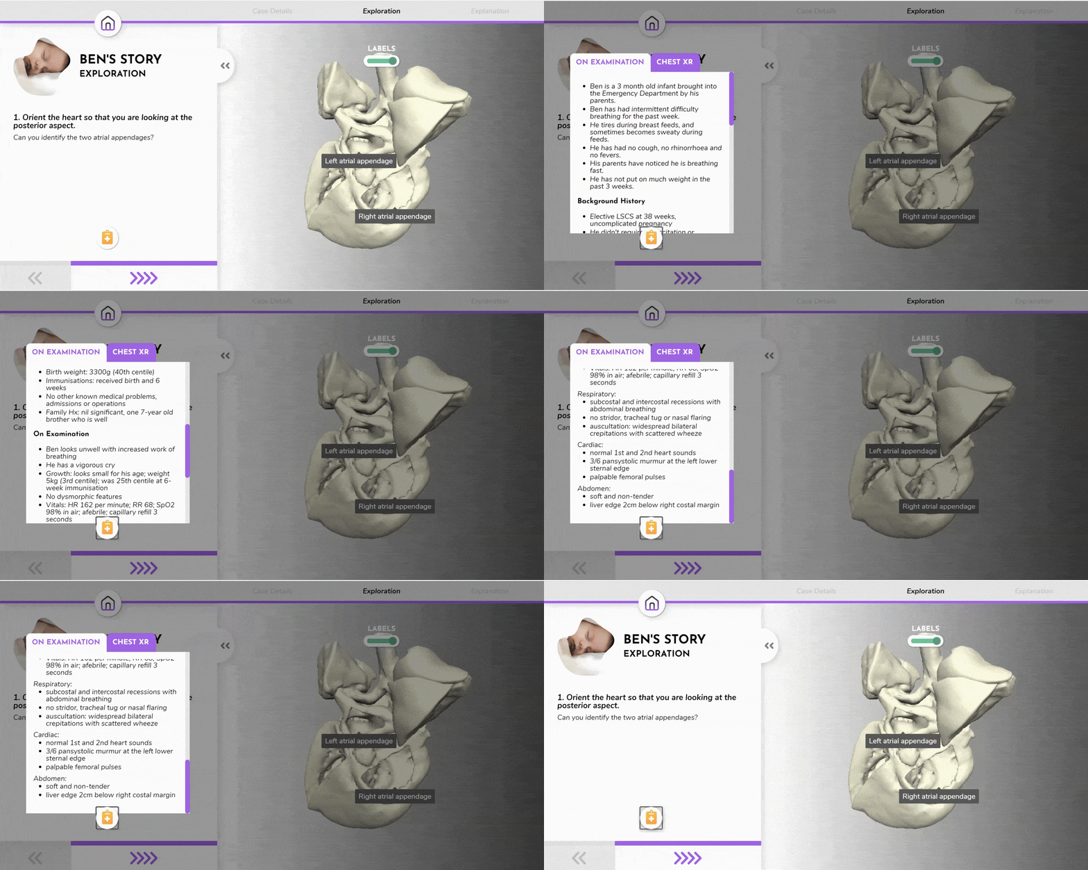
We integrated side access to case details so students can revisit vitals and other information as though they were really diagnosing a child.
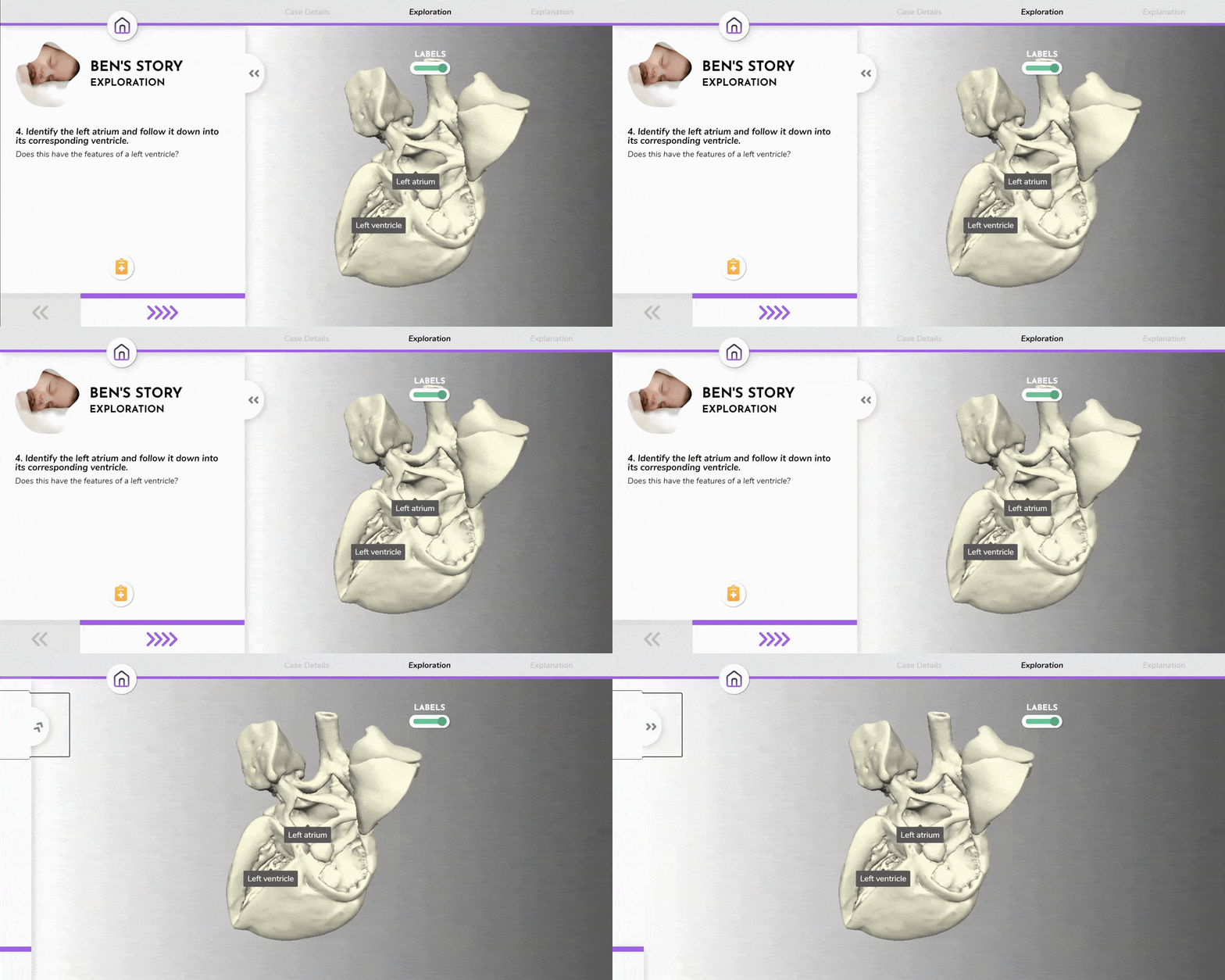
'Exploration' instructions are collapsible, and labels can be toggled on or off for optimum viewing.
In design, it is vital to become familiar with the users and the problem space. While we were unable to conduct proper user research and testing with medical students due to lockdown, the facilitators were just as important, and their insights shaped the success of the interactive module. Regular meetings with the education team helped ensure that what features we developed could best support students in their learning.
All three of us who worked on this project are design students, doing the same degree with the same foundational knowledge. However, we all possess different strengths and interests in various fields of design and technology. I found this to be extremely valuable because we had a broad reach as a team and achieved something none of us could have done alone.
Presented at the 2020 Sydney Medical School Education Showcase. See an article about this project on the University of Sydney website. Special thanks to my colleagues, Andrew Nguyen Le and Viswajith Unnikrishnan as well as our supervisors, Erez Nusem and Liam Bray.