 Mockup Template created by Mhd Muradi, GraphicList
 Mockup Template created by Mhd Muradi, GraphicList
Role UX/UI Designer
Platform Mobile Application

At exactly 11am, Friday August 15th, 2020, Adobe Creative Jams released a design brief inspired by the coastal conservation efforts of Australian surf wear company Rip Curl.
The theme being ‘Community Activism for the Coast’, we were challenged to develop a third-party mobile app that encourages local coastal communities and the larger public to be aware of, contribute to or actively support the maintenance of coastal environments.
Our target user had already been outlined for us - members of local coastal communities and beyond, perhaps visitors from neighbouring suburbs. There were many ways we could meet the requirements of the brief – whether it be by fostering awareness of threats to coastal environments, engaging the community to volunteer in preservation efforts or promote advocacy and activism for the cause of maintaining coastal habitats.
With so many avenues to explore, and no time for user research, we took inspiration from our own experiences and times spent on Australia's shorelines. We thought, ‘how can we inspire the coastal community to embrace the health of our coastal environments enough to inspire them to act?’
After a long brainstorming session over video call and Google Docs, forming ideas from the generic to the wacky, we had a true lightbulb moment. Why not integrate the cause with how people already experience our shorelines – through renowned coastal walks such as the Bondi to Bronte?
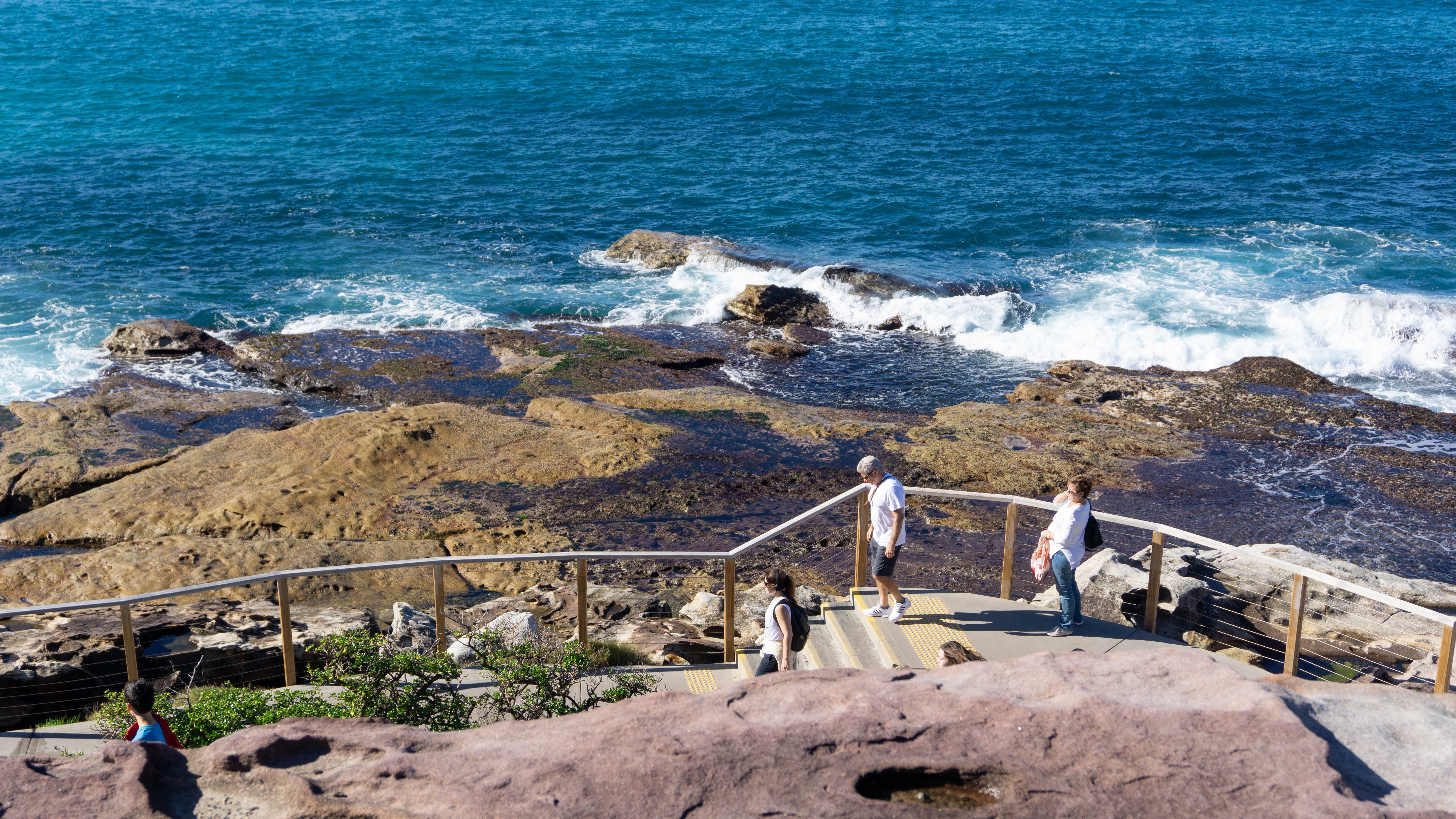
From here, we knew we wanted to be able to inspire users to care for the cause, and feel inclined to support conservation efforts through eye opening experiences. Because, what better way to encourage locals and visitors of these coastal communities to become advocates for sustainability, than to have them develop an affinity with the coastal space and give them the means to reach out and join conservation groups? So this is exactly what we did.
While we had an idea of how we wanted our application to work, we had a look at existing mobile applications that seemed to fall under our concept - both guided walk apps and not-for-profit applications.
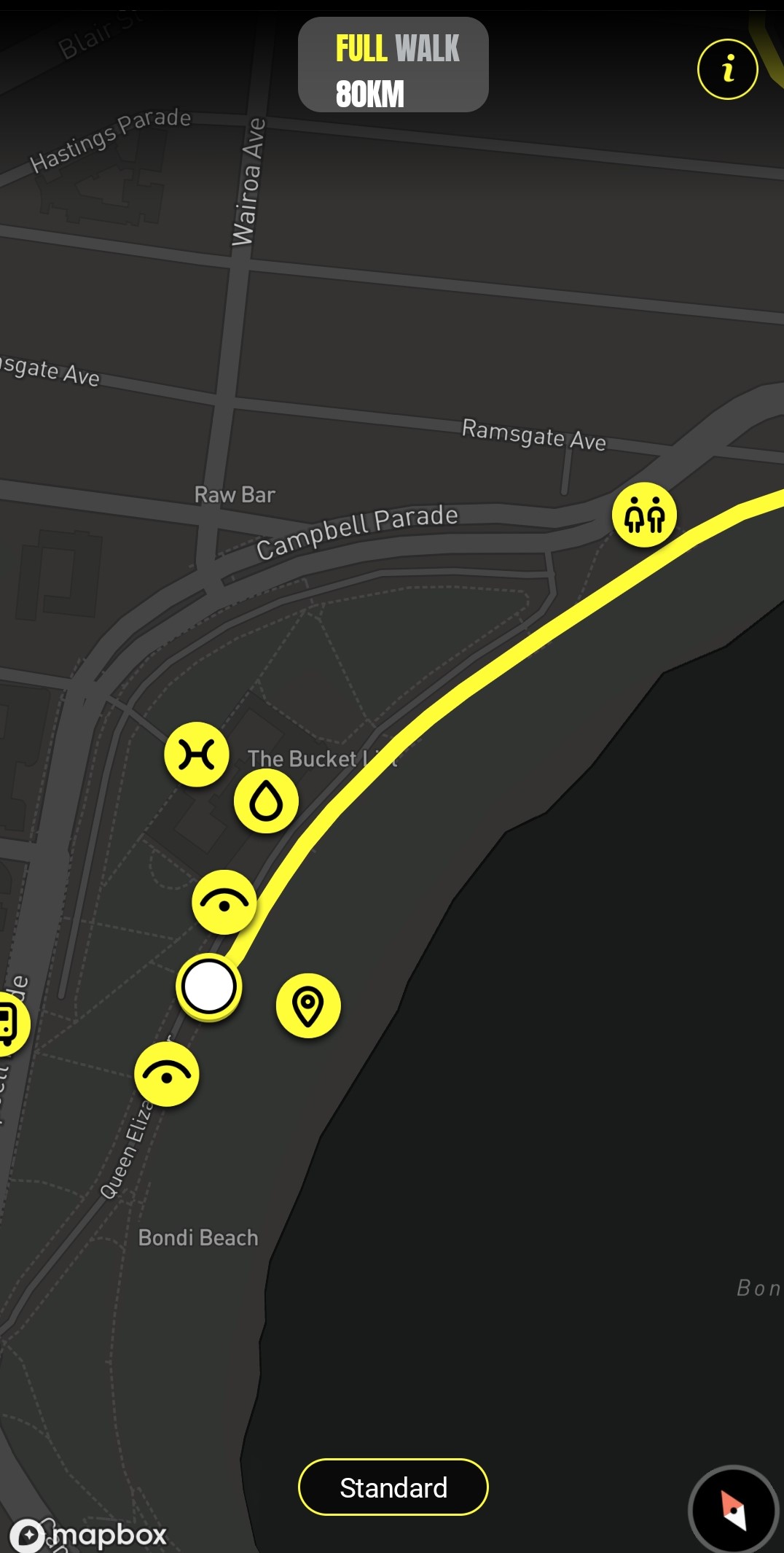
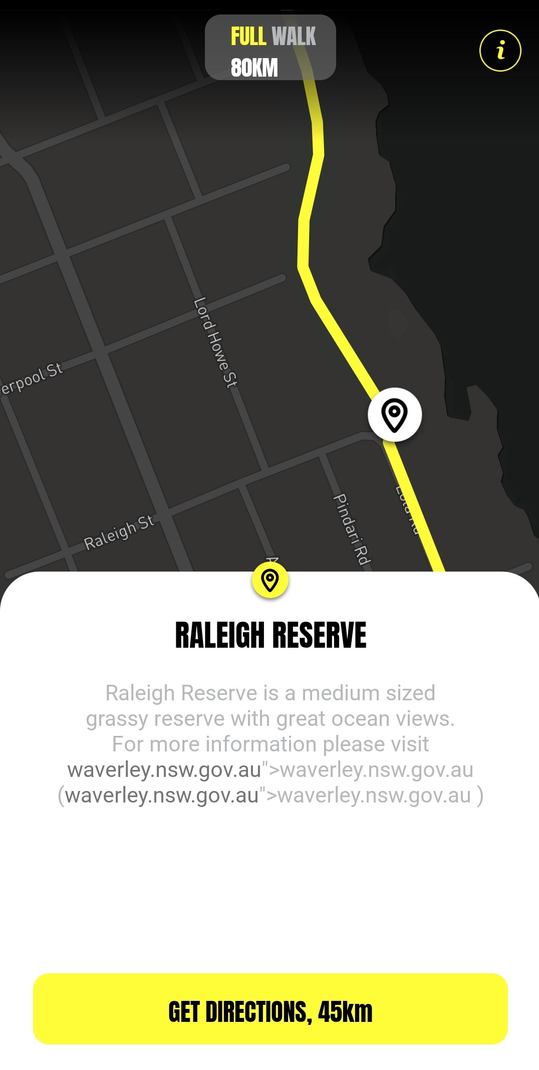
This app is a walking app, designed purely for users who are walking the full 80 kilometres between the two beaches.
Consistent and simple, it is a clear guide where information such as viewpoints, restroom stops and other important points on the journey can be accessed within the map's interface.
It uses a basic visual language with icons and a minimal interface, to keep users' attention on the path, and not their phones. It is a great example of designing with context and the user in mind.
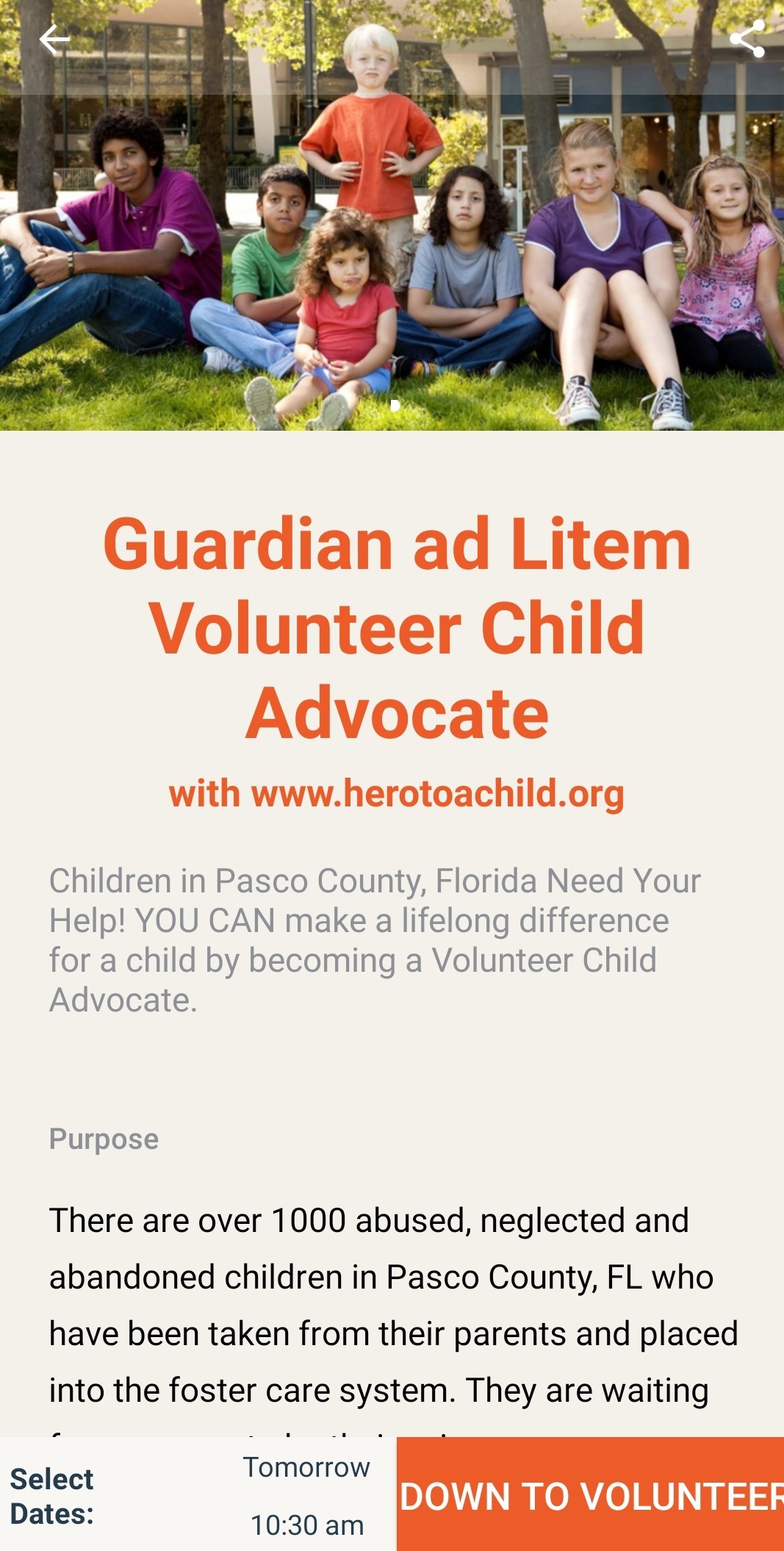
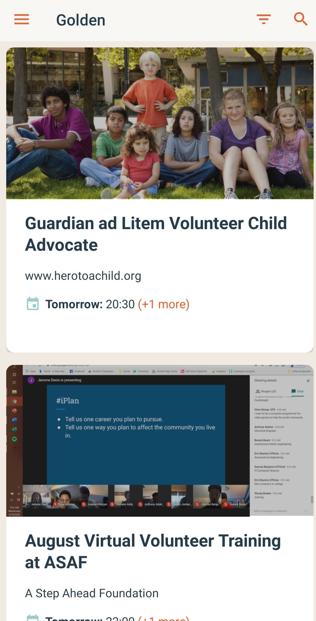
Golden is an application that makes signing up to volunteer opportunities and events quick and easy.
Based upon the user's location, the app gives suggestions of opportunities in their local area. Important details surrounding the opportunity, as well as quick access information helps users decide which ones are best suited to them, and that they would like to participate in.
While it isn't strong on the visual design suit, it is considerate of users' needs by displaying the necessary and appropriate information with conventional interactions.
Following on from looking at these precedents, had a clearer notion for how we wanted to combine both concepts to form a new app that would inspire users to develop an affinity for our coastal environments. After another intense brainstorming and discussion session, we knew what kind of track we wanted to follow.
We started out by drawing a basic userflow, with rough estimates for tabs and potential features that we had come up with. It gave us a good chance to quickly decide the most efficient architecture to give users intuitive access to everything the app had to offer. Some details might have made perfect sense in our heads but upon visualising and discussing them, we continued to make changes, omissions and additions.
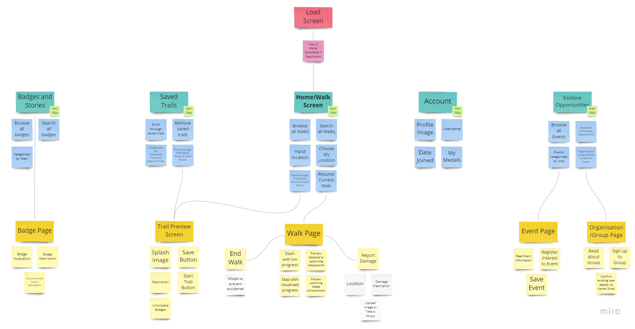
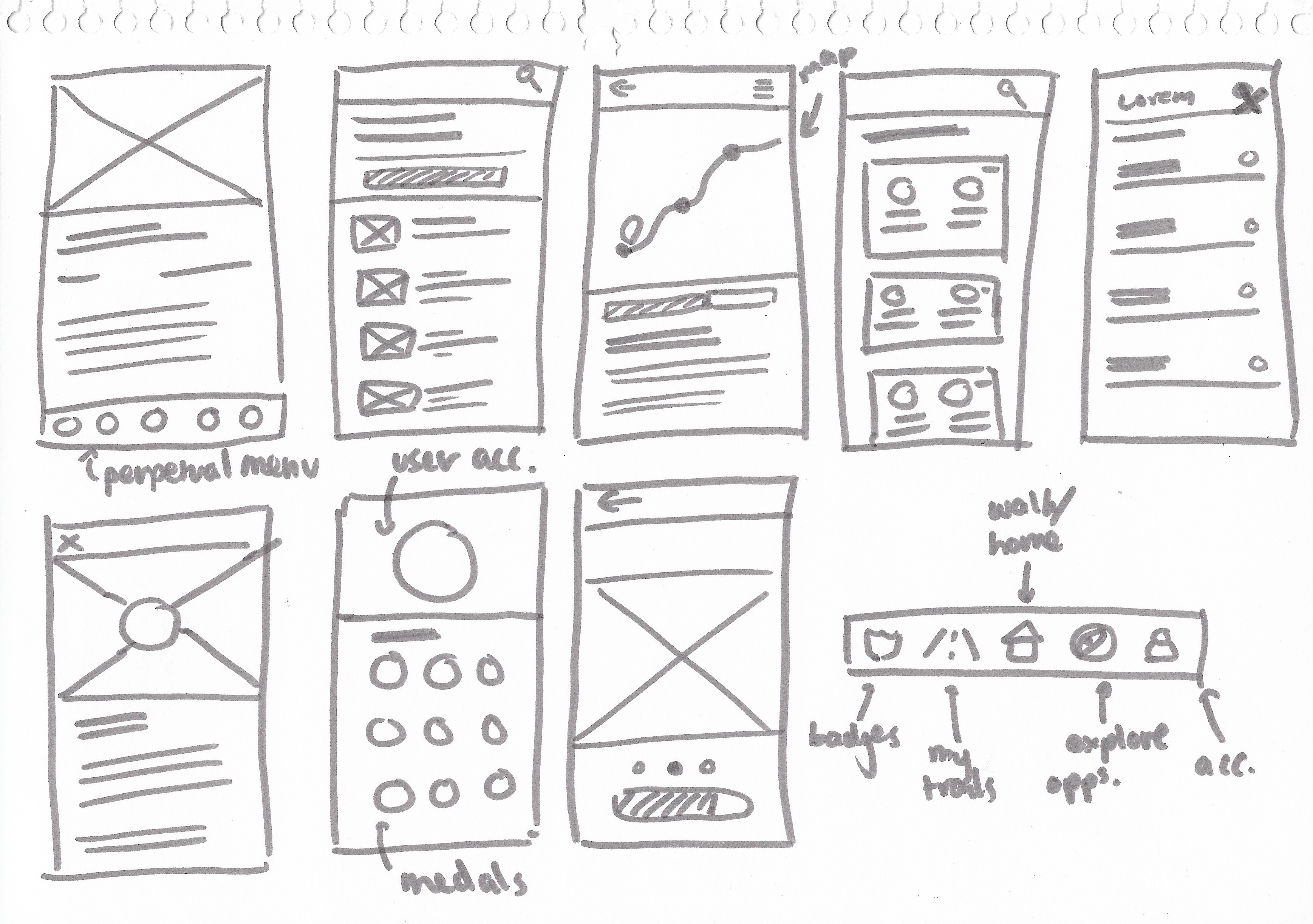
With a basic logical userflow ready, we moved onto developing sketches forming basic layouts for the interface. General positioning of buttons, menu items and other elements was the basis for this stage.
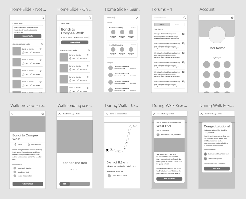
To really start locking everything into place, we evolved our sketches into proper wireframes. More refined design work took place here, such as deciding border-radii, textual information and transformations for dynamic screens.
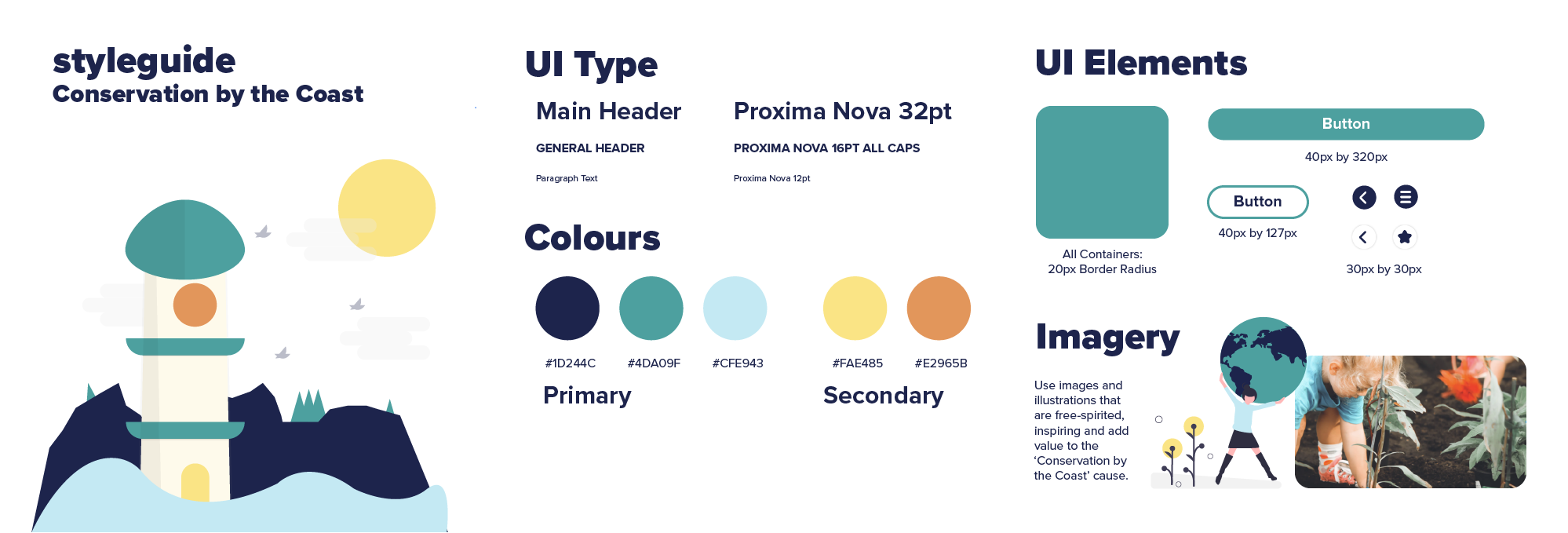
Finally, with a coastal inspired style guide, we filled in the wireframes with consistent font styles, colour, imagery and UI elements. We also finalised transitions and used the ‘Prototype’ feature in Adobe XD to simulate the mobile experience.
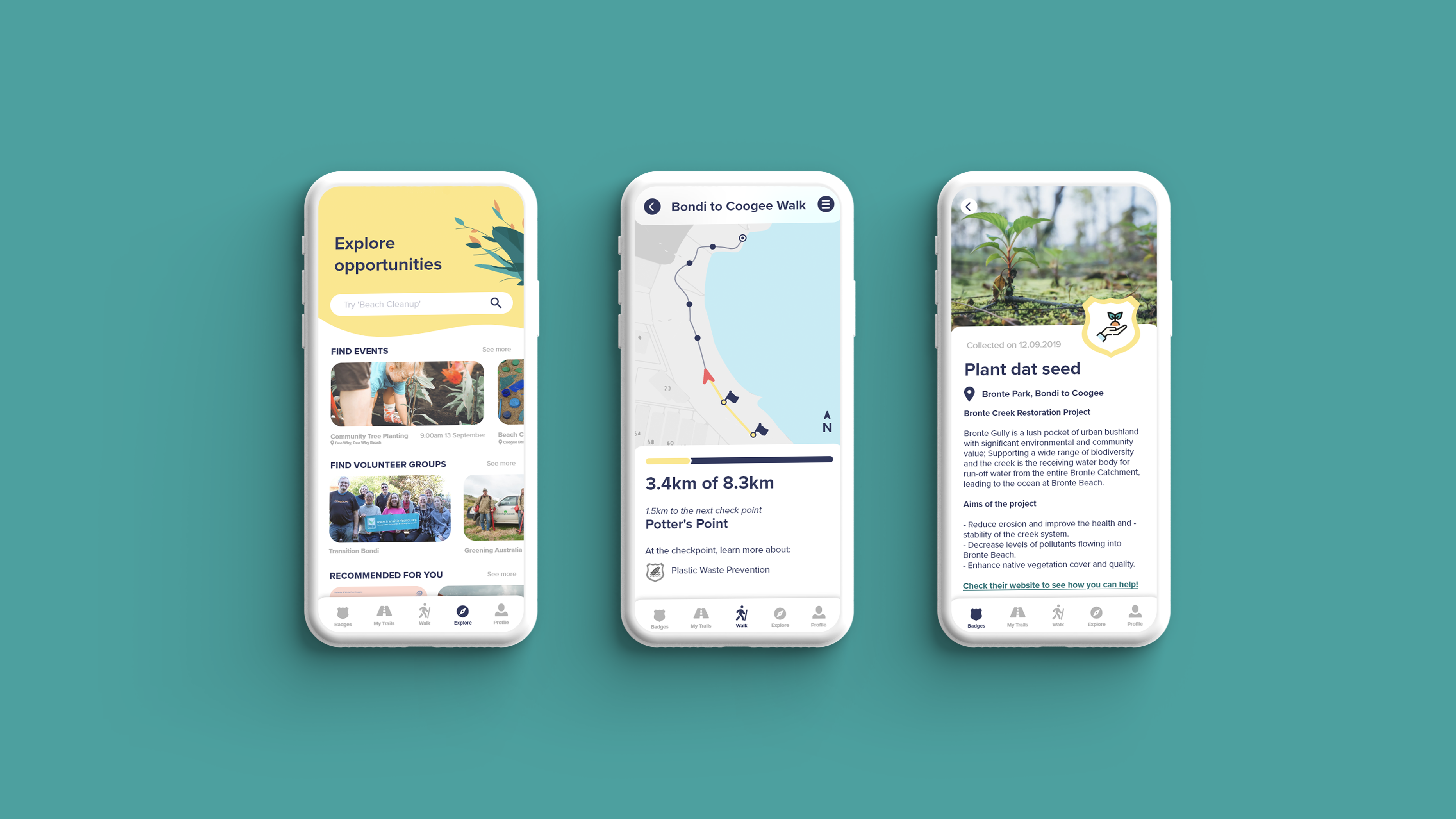
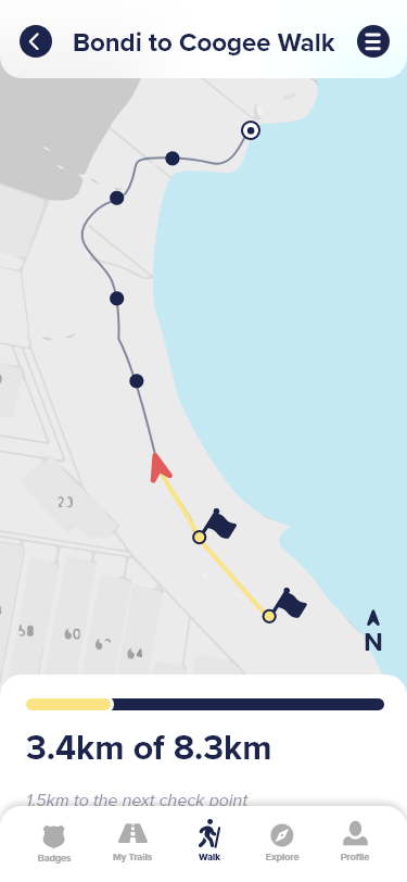
The following screens show how we applied these elements consistently across the entire prototype.
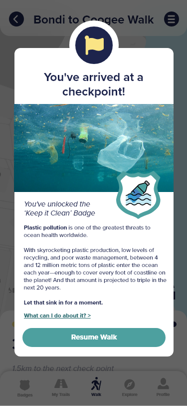
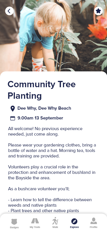
Conservation by the Coast encourages users to become proactive environmental heroes while ensuring they enjoy everything Australia’s beautiful shorelines have to offer.

This solution caters to locals living in a coastal town, as well as visitors from neighbouring suburbs. Our app encourages users to go on these coastal walks, and by doing so, they are likely to develop an affinity and sense of appreciation for the coastal environment in its glorious nature.

With location-based technologies, as users progress through the walk and pass set checkpoints such as a new suburb or beach area, they unlock badge achievements. They also unlock information about problems facing the coastal environment such as plastic pollution and land clearing and are given tips and advice on how they can help.
Generating excitement through ‘gamified’ techniques aims to drive home awareness of the degradation of our shorelines while sparking intrinsically-motivated people power for the cause.

Further, we make it simple for users to act on coastal preservation, with a simple feature that enables them to explore volunteer groups and community organisations in their local area. Users can browse existing groups, sign-up and even express interest for associated events. They are also rewarded with virtual medals, to enhance the sense of satisfaction users feel from doing good.
In total, we created 45 screens, encompassing all the features of our final concept.

The following interactive prototype demonstrates our final submission for the hackathon.
We joined the hackathon for fun - a last minute project to pass the time over the weekend before semester would start again. In all honesty, I didn't expect the brief to have such extensive criteria for our submission to be marked against. Reading each line of the rubric made me feel like I was completing another assignment - but under the time pressure of 60 hours!
I had doubts that we would be able to see to life anything thorough. It was, in fact, our first hackathon. However, working against the clock forced us to act decisively. We had set hourly and daily goals, and I felt like I was in the moment, designing in the most efficient manner I had ever done before. And at the end of it, we walked away with a detailed, consistent and unique design that addressed the brief in a creative way.
Overall, I felt like I upped my design game substantially from this two-and-a-half day hackathon, and sparked a little bit more confidence in my abilities as a teammate and a designer.